
Illustrating 3D Room Renditions
Overview: A fast, practical workflow guide for turning rough 3D room layouts into clean, hand‑drawn architectural illustrations using Roomsketcher, Illustrator, and Photoshop.
What you’ll learn
I want to share my process for something I rarely do: architectural room renditions. There’s some setup involved, but this guide streamlines the entire workflow so you can create precise, beautiful interior illustrations with less guesswork.
This is a combination of free 3D interior design software (I’m using Roomsketcher), Illustrator, Photoshop, and good old fashioned drawing skills to create conceptual spaces like this:
Initial room setup
Before jumping into any software, doodle up the general room sizes, wall placements, ceiling height, windows, and any other notes or requests from the client. Be sure to ask about the furnishings, decor, colors, lighting, and so on.
Channel your inner dungeon master and put those rough mapping skills to good use, because you’ll be rebuilding it as quickly as possible in the simplest 3D software you can find.

A rough map is fine as long as it includes measurements and object placement.
Previsualize the 3D spaces
For this project, I’ll be creating a wedding venue space with two distinct interiors—a bar and a bridal suite—each drawn from two different angles. There will be four illustrations in total.
The client provided a video walkthrough of both empty spaces complete with descriptions of furniture, measurements, and materials… sadly no dungeon interiors this time 😉 🗡️🐉
3D interior design
You could start from scratch using Illustrator’s perspective grid, but using a 3D layout as a guide dramatically speeds up the illustration process.
Having a rough 3D model built to perspective will make illustrating the finished rendition so much easier, faster, and precise.
Any interior design app is fine, it doesn’t need to be high quality, as long as the tool has the ability to:
Place walls and build a footprint of the space to be rendered.
Place furniture and objects to aid in drawing the finished rendition.
Adjust and export the camera view to achieve a clear perspective.
I’m using a free app called Roomsketcher, which does all of the above and has a lot of furniture and materials to play with (it’s a bit wacky though, take some time to learn it).
The free version is limited to a single camera angle on a single project, but nothing is preventing me from building all the required rooms in a single project and moving the camera around to get the necessary renders (annoying if you have to reshoot any prior views). Consider getting the paid version if this will be something you do on the regular.
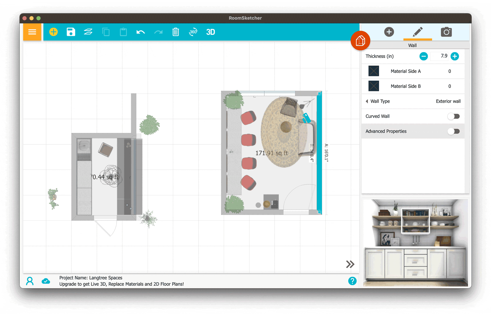
Roomsketcher free app showing walls, styling, and objects.
Staging the room illustration
Placing objects (such as chairs, tables, lamps, etc.) only matters to the extent of establishing a placeholder for the sake of perspective. If a suitable item isn’t available in the app, no problem: pick a tall, generic, office chair from the available objects and use those art skills (mine are questionable) to replace it with something nice, like a Herman Miller chair.
Materials and lighting matter even less. To keep things simple and clean, we’ll deal with the light and dark regions using brushes and shading later in Photoshop, where one can draw your own patterns/styles.
Export your room
After everything is placed and camera angles are looking good, export your 3d renditions as images. It doesn’t need to be perfect, just good enough to define the perspective lines and furniture placement. Accurate perspective lines ensure your final illustration feels grounded and architectural.

This is good enough to establish perspective lines and furniture placement.
Keep in mind these will only be used as guides, and none of the sloppy rendered visuals will wind up in the final artistic renderings.
Here are the final four rendered images:
Venue Bar Area

Back bar.

Front bar.
Venue Bridal Suite

Bridal hair and makeup area.

Bridal sitting area.
Illustrator line work
Import the 3D rendered rooms into Illustrator and place them on a background layer. This Renderings layer will be used as the perspective template.

Make a new layer on top called Line Work; we’ll be drawing the actual illustrations here, and by drawing, I mean tracing the primary edges and surfaces of the renderings.
Choose a line style that fits your illustration aesthetic and begin tracing the main edges of the rendering until all the key edges are defined. Make any adjustments needed.
My illustrations will use this brush stroke for every line, with the line weight set to something that feels right—thicker lines for major edges and thinner lines for smaller details are fine and will help with hierarchy.

The first pass looks like this:

Notice how the bar counter was condensed into a single surface.
Continue by adding smaller lines to flesh out the finer details, objects, and other surfaces as needed.
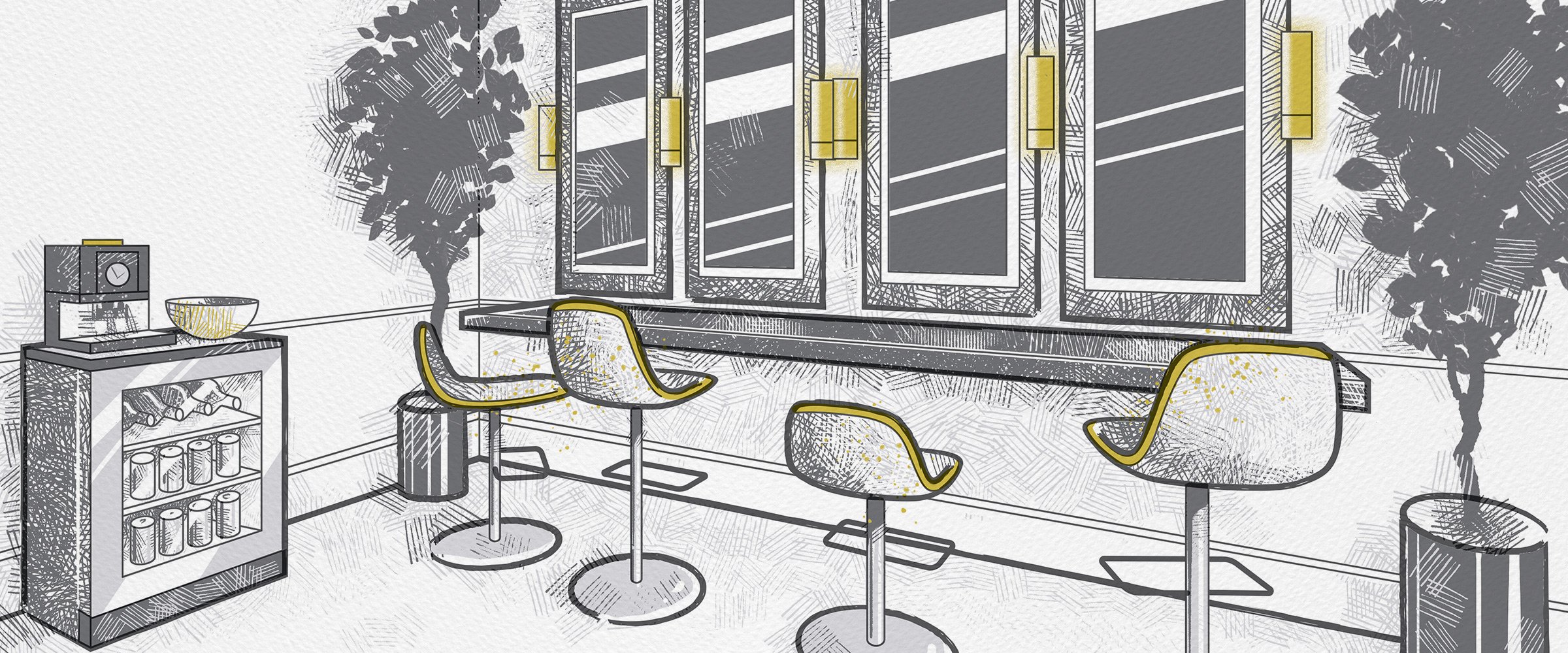
Venue Bar Area
The design brief for the bar area included stocking shelves with wine, liquor, wine glass racks, lower coolers, mesh upper cabinets, a large decorative light, and living wall with a neon “Cheers!” sign written in a loose script.
A lot of these elements were easy enough to add in Illustrator as simple shapes and patterns.

Rendering of the back bar.

Final line art of the back bar.
When in doubt, add a plant or two to give your drawing some Feng Shui. The natural forms are more easily added in Photoshop with leaf brushes, so you won’t see them in my Illustrator file.

Rendering of the bar counter.

Final line art of the bar counter.
Venue Bridal Suite
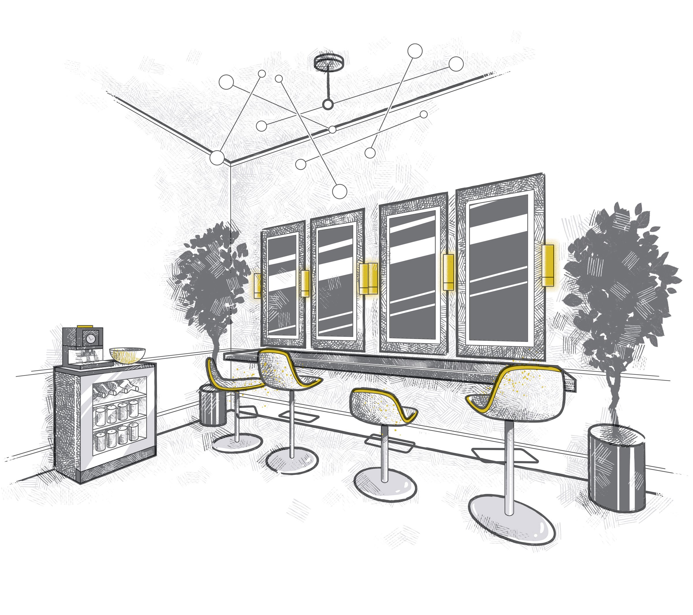
The design brief for the bridal suite focused on a comfortable couch and sitting area behind a series of adjustable salon chairs, tall mirrors, beautiful lighting, and a floating black granite counter.

Rendering of the bridal suite mirror bar.

Final line art of the bridal suite mirror bar.
A lot goes into preparing the rooms; consider the window measurements and grids, wall measurements, furniture size, ceiling height, floor and ceiling molding, light fixtures, and the spaces in between.
By setting up the 3D dimensions properly in the beginning, the layouts are guaranteed to work.

Rendering of the bridal suite seating area.

Final line art of the bridal suite seating area.
Once the line work is completed select all (Ctrl+a or ⌘+a) and copy everything (Ctrl+C or ⌘+c). We’ll paste our work into Photoshop shortly.
Photoshop brush work
Think of this final step as the “coloring book” phase, where we take the line art and begin filling in the surfaces with texture.
Create a new Photoshop document and paste the line work (Ctrl+v or ⌘+v) onto a new layer. This layer should be locked and kept near the top of the layer stack; most of the brush work will be on layers underneath the line work.
Size considerations
Because these illustrations will be used on large poster boards to promote the new spaces, I want my docs to be around 5000px on the long side.
By pasting from Illustrator, the vector line work can be scaled up to any size needed without losing quality.
Photoshop brush choices
Select a brush or two that will stylistically fit the design and make great tone/textures. There are far too many great brushes available for Photoshop, and I get a bit of decision paralysis when deciding which to use.
It’s helpful to have a nice line brush (hard pencil), an all-purpose tonal fill brush (crosshatching), and an effect brush (leaves). I also used some simple soft/hard round brushes to fill in solid areas and erase marks.
For a killer selection of brushes, check out the Kyle T. Webster collection at Adobe.


A stylus is helpful for brush work
When painting or illustrating, it’s extremely helpful to use a stylus that allows pressure settings, tilt, and other goodies for a more tactile drawing experience. I use this Huion tablet (which is pretty fantastic IMO) and won’t break the bank like a Wacom of the same dimensions.
Filling in tones and value
With brushes from the sets mentioned above, I filled in the light and dark values using a limited palette of dark and light gray. Here’s the work-in-progress:
Shading and textures brushed in using the marquee selection.
Finished shading and textures and added accent colors.
Keep adding additional layers as needed and organize them by subject or area (chairs, walls, etc.) Use the marquee selection to help restrict painting to certain surfaces. Continue laying down values and brush work across the composition. Draw trees, create reflections with a hard swipe of the eraser, and incorporate some color accents. Keep things loose and don’t get too precious in any one area, and always let the brushes show off their personalities.
Photoshop pro tip
Photoshop brush erasing tip: Hold down the tilde key (~) to make the current brush behave like an eraser.
Wrapping up
Here are the completed architectural room illustrations created using this 3D‑to‑Illustrator‑to‑Photoshop workflow, which will ultimately be used as supporting graphics on large informational poster boards and flyers.
Enjoy and thanks for reading!


