
SignUpGenius UI/UX Case Study
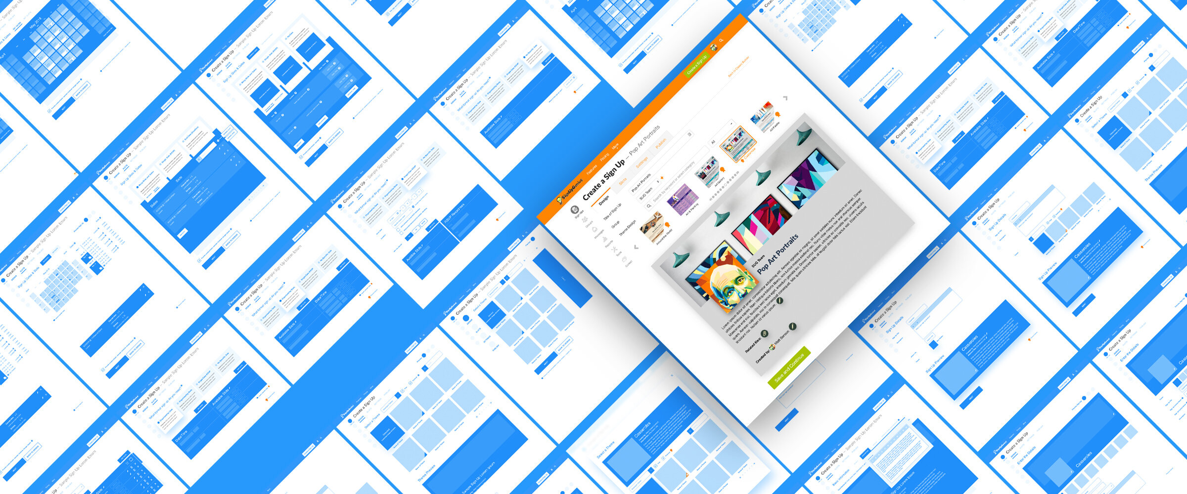
Overview
SignUpGenius is a service that simplifies the process of coordinating events and people by providing online sign ups. Whether a group needs to schedule parent teacher conferences, host a soccer tournament, or raise funds for a nonprofit, SignUpGenius is a one-stop solution that does away with the need for paper sign ups, “reply-all” emails, and phone trees.
SignUpGenius is ubiquitous in the online sign up space and has been around for over 10 years. Each month over 250 thousand events are created, and the site receives nearly 14 million visitors in that time. At any given moment there are over 10 thousand people using the site.
However, as happens with many websites over time, the SignUpGenius wizard tool felt dated and was a confusing and clunky user experience — especially for new sign up creators.
“The interface seems very clunky — like technology from several years ago. If you compare it to setting up a Google Form for example, it is way backward. I consider myself very “tech-savvy” and I find that even simple things like editing a survey, and FINDING the URL so that I can text it out to my students, is very cumbersome.”
SignUpGenius prior to 2019
For the sake of posterity, here’s a 5 minute speed run of creating a sign up from beginning to end, with no particular objective other than to show the screens and some basic options. Creating a real sign averages 15-20 minutes, but might take upwards of an hour.
UI/UX Challenges
Creating sign ups for any kind of event was a cumbersome 6 step process full of trial and error. New sign up creators might spend an hour figuring out the options, settings, and formatting only to realize at the very end something was wrong. Often this meant going back to earlier steps and making corrections — or worse — throwing it all out and starting over (some decisions are irreversible 😡).
“I find it awkward to go back in any part of the program if I make a mistake. I have restarted the process several times, and that gets very frustrating.”
Pain Points
Too many steps with too many decisions.
Lots of confusion choosing dates and assigning items.
Can’t see the results of decisions until the very end.
Settings and tools are difficult to find.
Disconnected from features such as theme customization & messaging.
Not mobile friendly.
Does not scale well to massive sign ups.
Built on old technology, lots of spaghetti, cumbersome to maintain.

SignUpGenius circa 2019 — From beginning to end. Only the very last step revealed what the user had created, often to their surprise.
When it came to assigning on which days the event would take place and what items people should bring, the third and fourth steps were particularly frustrating.
Lots of inconsistent formatting, it’s a chore to use.
The overall process was rife with inconsistent UI and formatting, unnecessary inputs, obtuse errors, strange presumptions and flow, buried settings, and no feedback on exactly what was being built until the very last step.
The burgeoning sign up creation tool had become large and off-putting for the occasional sign up creator; simply creating up a new sign up was a chore. As new features are added, the ever-growing amount and complexity of choices have made it more and more difficult to use the tool efficiently (Hick’s Law in design lingo).
Here are the various options depending on the type of sign up created, and the resulting sign up:

Steps 3 and 4 require lots of input and a significant time investment without showing the sign up creator what they’re actually building.
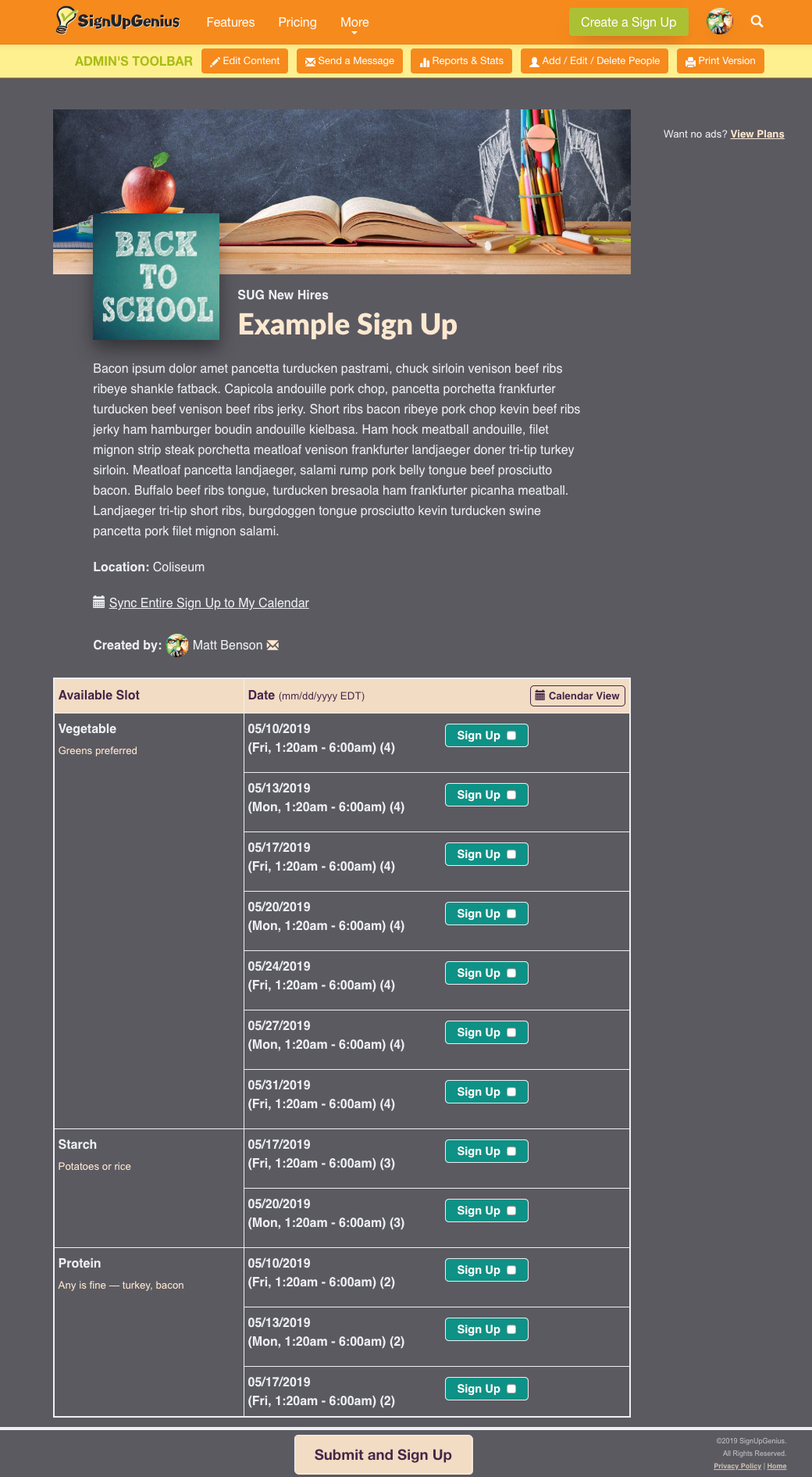
Step 6 is the first time sign up creators will see the result of their actions.
“Unfortunately, the process is far too complicated. There are too many steps regarding unneeded additions and they are NOT well explained. After having stumbled my way through the process four or five times (plus another four or five that I just gave up on), I’m beginning to understand it. But I have to reeducate myself every time. It is just not simple enough.”
Returning sign up creators have learned to cope with the idiosyncrasies after an initial hazing period (which could last a couple years). Those who have grown up with SignUpGenius have simply learned to adapt and deal with the oddities.
Everyone’s time is valuable — watching users stumble through the process and talk with support until things were correct was not an ideal experience.
“I really like sign up genius but it takes some time to figure out how to set up sign ups according to what you need. I’ve been using it now for about 2 years so I have a good understanding of it.”
Redesign Goals
Over the last decade each step of the wizard had been patched and updated separately; like building a car over a 10 year period using newer and newer parts, but not changing the body at all. The entire wizard tool needed to be tweaked from beginning to end. A more holistic and unified effort was clearly needed.
The laundry list of improvements was extensive and covered many UX best-practices and business objectives:
User Experience Redesign Goals
Simplify the process and reduce steps without losing functionality.
Respect the user’s time by allowing flexibility and freedom of control.
Be consistent with inputs, functions, and messaging.
Increase confidence on each step to reduce input errors.
Maintain visibility of the sign up design throughout the creation process.
Don’t wait until the end to reveal what a user has created.
Update help documentation, microcopy, and video tutorials to aid new sign up creators.
Incorporate design customization tools and messaging into the flow.
Make the system as responsive to devices as possible for maximum utility.
Business objectives
Retain ad impressions and revenue despite the streamlined experience.
Use the same databases and functions to continue use of the legacy system.
Rebuild in Angular for a more seamless experience and consolidated code base.
Promote subscription benefits and clearly indicate the premium options.
Reduce support tickets.
So in a nutshell: make it simple and fast, don’t lose ad revenue, and increase sign up creator confidence and success rates.
Simplifying The PROCESS
The entire sign up creation process needed to be condensed and simplified as much as possible. Like-tasks could be grouped together into a single step, and the sign up creator should immediately see the outcome of their choices in the context of the finished sign up.
The process would ideally remain a series of steps as tabs, and allow navigation to any section at any time. To prevent navigating away without saving first, all areas will have checks in place to prompt the creator to save if they try to leave without committing changes.
Creators would be gently guided into the basics, and quickly given more freedom as data was entered. Areas that are dependent on these choices would naturally become available when data permits.
Step 1 & 2
The first couple steps establish the description, design, and other necessary setup. Generally it was a mess of inconsistent layouts, hierarchy, scripting, and input choices that were less than ideal, and designs dominated the view in a clunky catalog layout.
Page goal: Basic info and design

Old step 1 & 2 — Initial settings, intended audience, and description.
Wireframes & UI Planning
Dozens of exploratory wireframes were generated with various combinations of form inputs and layout selections. Weeding out unnecessary inputs was fairly easy at this early stage, and because this was a mashup of two steps, a shotgun design approach was ideal to get as many discussion points as possible in front of stakeholders and the support team.

Dozens of wireframe were generated in all sorts of combinations.
Reducing the options and adjusting the flow.
Much of the discussion revolved around how many options to have on screen at one time, and and how large & interactive the design preview should be. Based on years of feedback, the support team and stakeholders steered towards iterations which seemed to address the most common issues and provide all the utility with the smallest screen real estate footprint.
The term ‘above the fold’ was common in many discussions.
Page results

The new step 1 puts everything in context. Excessive fields have been eliminated, a full size preview is visible, and settings are located next to their pertinent locations.


Condensed and clean, all the clutter has been removed.
There are over 7,000 pre-made sign up designs with keywords and other searchable meta. To reduce clutter, design choices have been pared down to five in a carousel format, and are separated into two dozen categories with a live-search filtered list. Selections are applied in real-time without a reload. Pro customization options have also been added to further allow design editing via a modal (not shown).
All the inputs have been culled to remove anything excessive; only the essentials are surfaced. Optional elements such as file uploads and detailed descriptions can be edited by interacting directly with the sign up preview.
What about the ads?
For many non-paid users, the page is a little narrower with ads appearing at the top, bottom, and right or left side. The ads would reload automatically based on a timer, and will remain clickable even when dialogs and modals are open.
A LOT of work was put into creating a type of responsive modal that allowed parts of the page to still be clickable even when the modal or dialog was open 😐.
Step 3 & 4
Considered by many to be the most confusing part of the sign up creation process, step 3 and 4 are the source of more drop offs & do-overs than any other step. Because this step is essentially placing and assigning items on a calendar, the lack of an actual calendar and preview was frustrating; it didn’t look or feel much like a calendar, or really anything people were familiar with.
The closest description to how it ‘felt’ was a calendar tool made by programmers for other programmers — a far cry from the target audience or casual sign up creator (soccer mom, teacher, family planning a reunion, etc.).
Page goal: Set dates and Items

Old step 3 & 4 — Sign up type, setting dates, and assigning items/slots to each date.
Steps needed to be repeated to enter more data.
If you really dig into the old screens, there is a distinct lack of updating anything in real time (mostly because of the tech constraints from years ago). Many pieces require the entire page to be saved and revisited. Even long lists have prompts that require checking a box indicating your intent to go through the process a second time just to add more.
Some sign ups simply needed to be restarted.
From a development standpoint, the tool was mostly a one-way affair. Once a path was chosen, the sign up creator was more or less locked into it (which resulted in plenty of restarts — scroll back up to read the reviews 😉).
The biggest question needing a solution was “…what is the fastest way to choose dates and assign items to those dates?”
Wireframes & UI Planning
A whole lot of wireframes were once again generated to test out the balance between calendar, preview, and data input, and other essential functions.

A whole lot of wireframes were generated with possibilities on how to merge two steps together.
The results of these wireframes helped underscore the need for simplicity and gave a better understanding of the creation flow.
The wireframing sprint additionally surfaced a few issues the support team regularly dealt with, issues that could be designed into the flow now rather than spaghetti’d in later (if time even permitted).
Component Goal: Choose Dates and Items
One particular issue prior to 2019 is that it was impossible to have the same item listed on the different dates with different quantities for say, 8 casseroles were needed on Saturday, but only 4 on Sunday. The wireframe sorted out one obvious way to achieve the flow (the database didn’t even need to change to accommodate this feature).

A streamlined flow was prototyped to add multiple items on various dates.
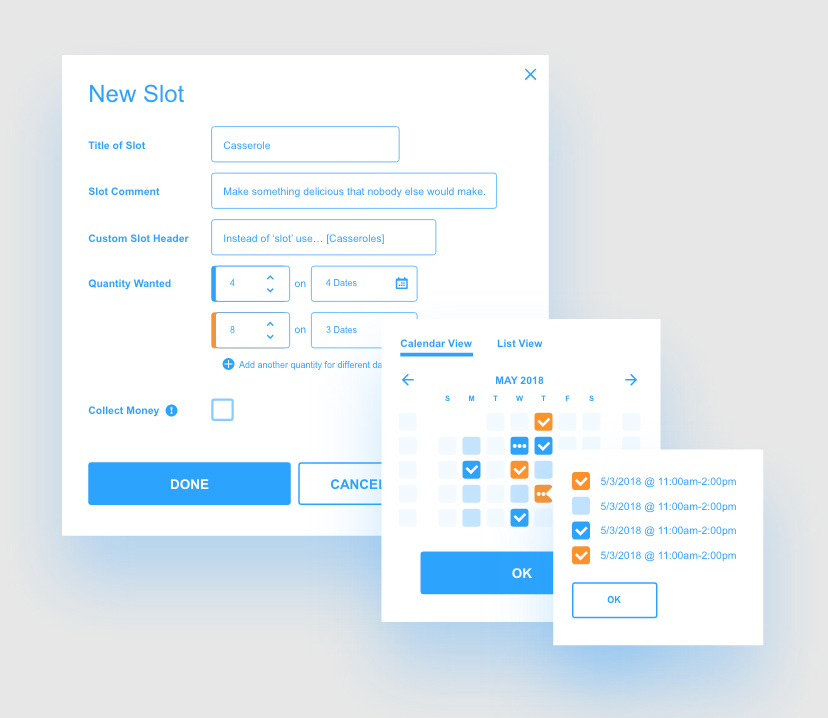
“Add another quantity” was something the support team had on the books for years.

Revised flow for adding items/slots to different dates.
The outcome resulted in a flexible set of inputs that allowed the sign up creator the freedom to enter dates and items in any order.

Page results

The new step 2 shows the sign up preview in real time. The selected sign up type is shown with placeholders, and adding dates & items are clearly indicated.

Multi-date additions and edits.

Recurring days.

Recurring time slots (multiple slots per day).
All the date and item choices are built into the sign up preview in real-time. Creators are now able to do anything in any order they wish, and have the tools available to make mass entry, multiple edits, and add repeating data — they even have the ability to change the sign up type altogether.
By allowing so much freedom among data entry functions, sign up creators should never need to start over and will have full awareness of the end result.
Step 5
The settings step became the catch-all for all miscellaneous options and modifiers to sign ups. Over time it became a complex and delicate page containing everything that couldn’t be shoe-horned into the other complex and delicate steps.
Page goal: Assign settings

Old Step 5 — Settings and custom questions.
The same general comments from previous screens apply here too, with the addition of some really old modals and other dialogs that were dated and didn’t match one another — and the code behind it all was spaghetti from years of updates and modifications.
This page needed a lot more work behind the scenes than the screens indicate.
Page results
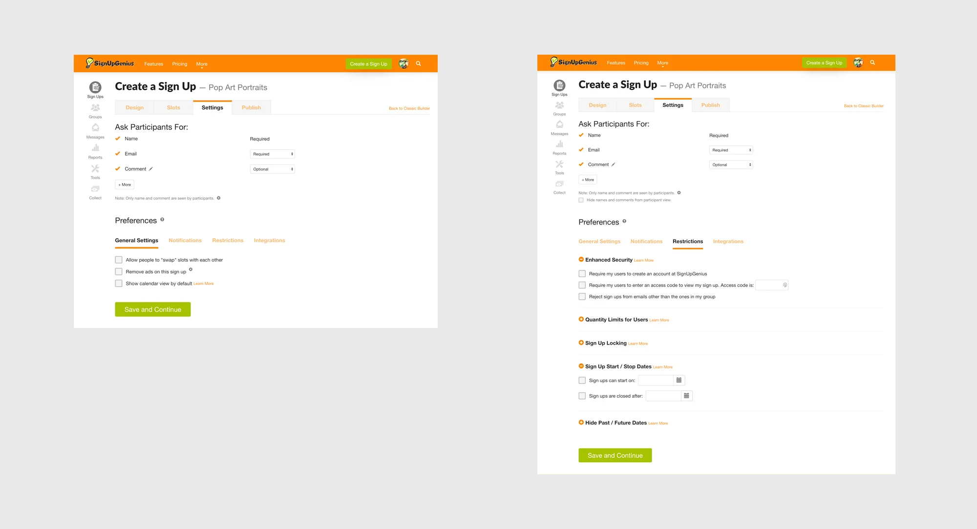
The new step 3 settings have been tidied up and organized into logical groups.


Better organization and groupings.
More utility than anything else, this area was restructured to clearly define groups of options. The preferences are now clearly tabbed into categories: General Settings, Notifications, Restrictions, and Integrations.
Most other functions on this page take advantage of progressive disclosure and collapsible areas to reduce clutter and only show what’s pertinent. Disabled options and premium features are clearly marked and everything has been given help text and microcopy where necessary.
Final step
The final step was the very first time a sign up creator could preview their sign up. More often than not, new users would realize they chose the wrong settings, set up the dates wrong, or didn’t have a confident grasp of how the slots fit into a sign up — there was even a very important screen missing from the preview.
Page goal: Sign up preview

The old step 6 preview was the very first time a sign up creator would see the consequences of their choices.
The only user decision to be made on this step is whether to Edit and go back to make changes (very likely), or Publish. Obviously missing is the ability to stop and save for later (one would have to Publish, then choose not to go live).
Sign up creators couldn’t see completed sign up until it was published.
There was another very important screen that the sign up creator could not see — the screen that comes after choosing a sign up slot. The mystery screen contained all the data a sign up participant would need to fill out to complete their sign up (i.e. name, quantity, comments, favorite color, shirt size, etc.).
The only way to see the mystery screen was to publish the sign up and go through it as a sign up participant to make sure everything was laid out as intended. Hardly an ideal way to preview something 🧐.
Page results

The new step 4 preview allows toggling between previews.
The final step in the creation process now gives a full preview of the sign up and participant form, as well as mobile views for each (not shown).
The decision a sign up creator needs to make on this page is now clearly indicated as Publish and Save Draft.
RESULTS (TL;DR)
More than just a redesign, this project was a bottom-up, back-end to front-end rebuild of the entire sign up creation tool.
Decisions were based on years of feedback from customers, stakeholders, and support tickets. Wireframes were made and plenty of iterations happened — the entire creation process was reconfigured to reduce the steps needed by nearly half without removing any functionality. The messaging for every step was made consistent and clear, tools were moved to more logical locations, and the sign up itself is visible every step of the way.
Monthly Events Created
Let's just say the database is very big and very optimized.
Monthly Visitors
That's a lot of traffic.
Concurrent Users
Everyone is busy signing up for things 😉
Wrapping Up
The new system is currently live and SignUpGenius is actively gathering user feedback. So far things are going swimmingly and the overall flow has been greatly improved.
Thanks for reading!