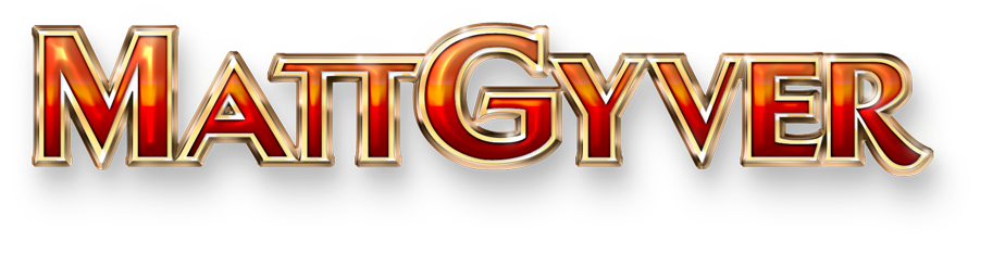
Mecklenburg County 250th Anniversary Logo
Overview: A case study of my process and illustrations behind Mecklenburg County’s 250th anniversary logo.
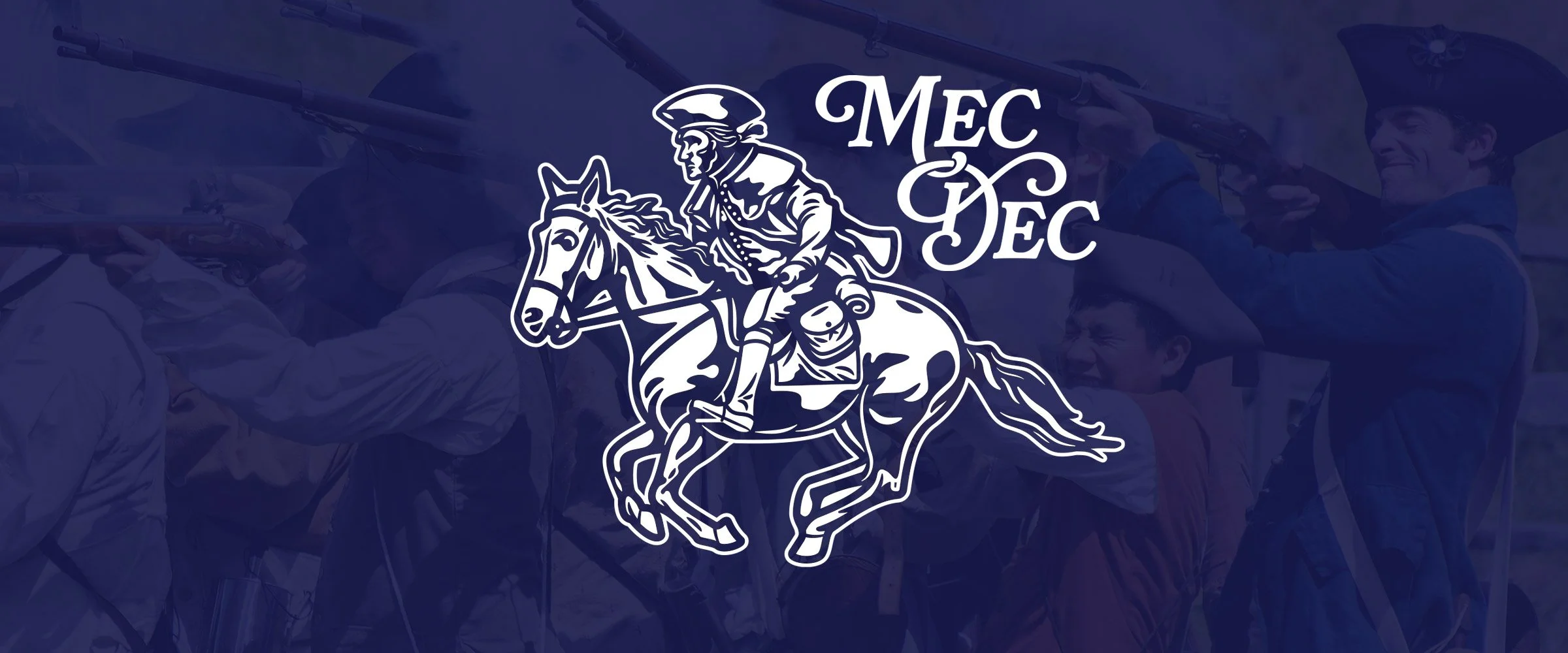
For two and a half centuries, Charlotte has celebrated the spirit of the Mecklenburg Declaration of Independence with parades, speeches, and even cannon fire echoing through uptown. This enduring ritual of pride and remembrance has inspired a visual identity for the 250th anniversary; a logo that honors the past while speaking to the present. This historical logo design transforms the Spirit of Mecklenburg statue into a flexible visual system used across coins, pins, labels, and celebratory merchandise.
Illustration References
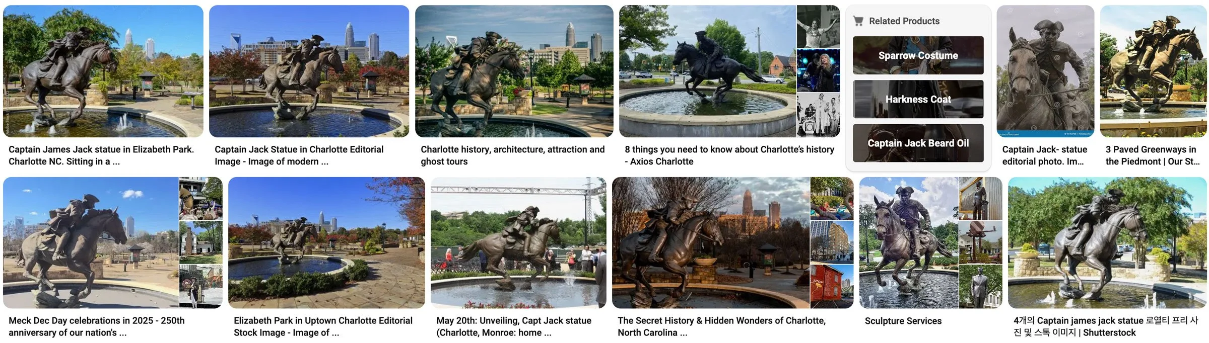
The logo is based on the Spirit of Mecklenburg statue in Charlotte, North Carolina. This design captures Captain James Jack on horseback as he carries the Mecklenburg Declaration of Independence to Philadelphia in 1775. The original bronze monument, sculpted by Chas Fagan, stands at the corner of 4th Street and Kings Drive as part of Charlotte’s Trail of History, honoring Jack’s daring Revolutionary War ride and the county’s role in America’s fight for independence.
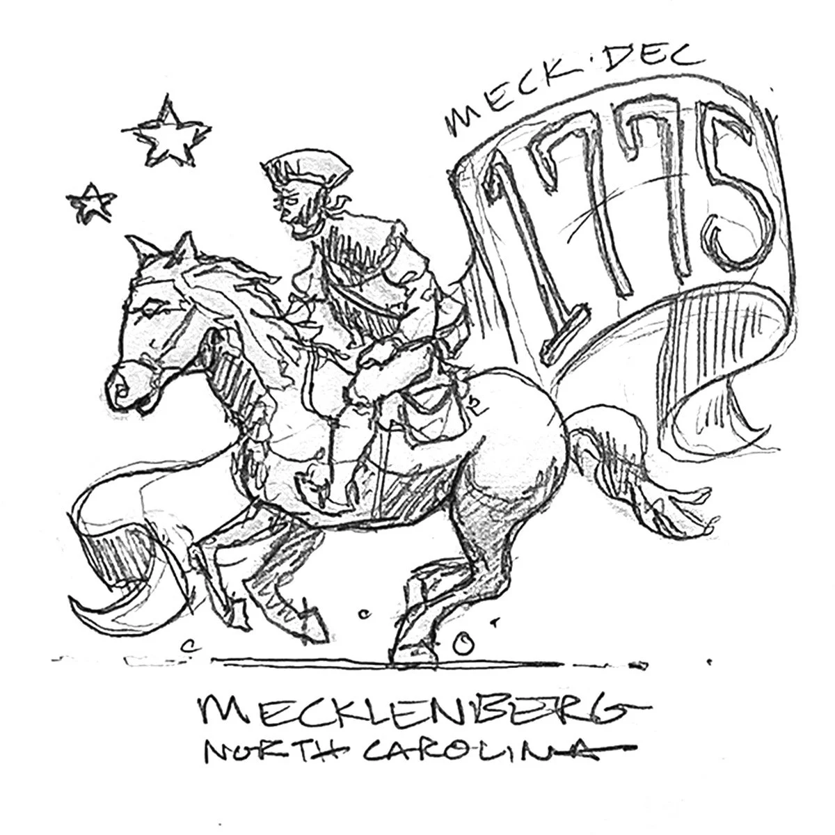
Typography & Logo Sketches
The illustration process always begins with several sketches in order to get the rough idea on paper; it’s all about finding a form that everyone loves. Text was mostly decided beforehand, so the focus of the sketches were to highlight different type stylings and communicate history.
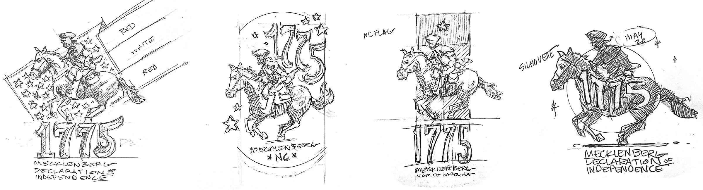
These early sketches established the historical tone and badge‑style direction that shaped the final logo.
The final variations are mostly circular and badge shaped, which works perfectly for pins, coins, stickers, and more. Badge‑style shapes work well for commemorative branding because they translate cleanly across coins, patches, and small‑format merchandise.
Products and swag weren’t decided yet, but I always try to make sure something works on a coin—I love challenge coins as an everyday-carry item.

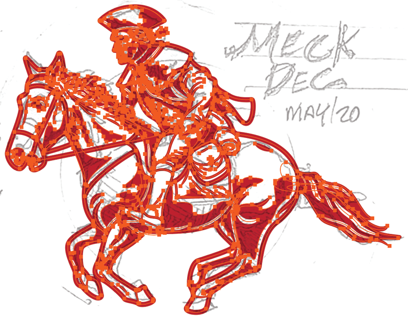
Once the direction is chosen, I gallop over to Illustrator and use the pen tool to begin the vector illustration. The usual process is to define the primary outlines and establish a line weight and style, then start on the contours and shadows. There are no shortcuts here, unless the figure is a pristine illustration that can be cleanly image-traced. A sketch is usually good enough for me because I prefer to refine digitally. ‘We’ll clean it up in post’ as they say.


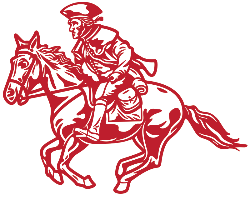
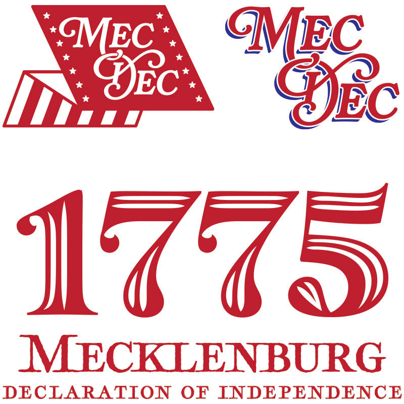
After the initial illustration is done, extra elements begin to come together. Type lockups, little icons, badges, and more. The fonts used in this have a classical feel with a modern twist.
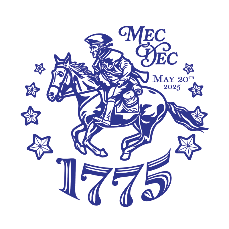
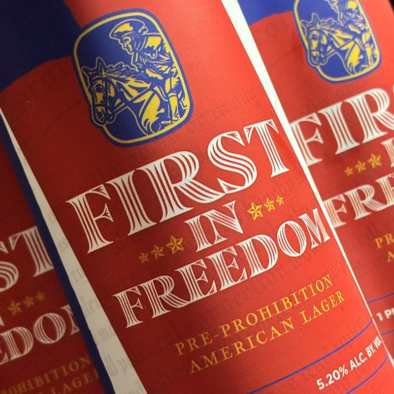
The blue colorway.
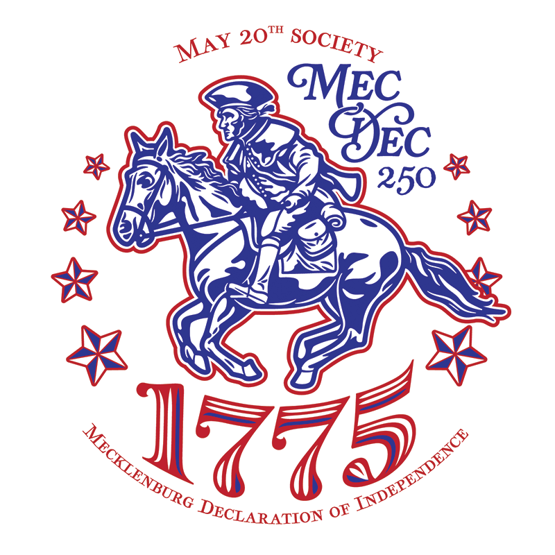
A combination of both colorways.
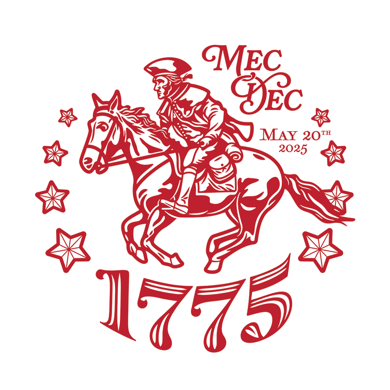
The red colorway.
All these elements finally come together into a finished piece. By layering smaller pieces together, and having an abundance of extras, the logo is flexible enough to be used across all sorts of print and media—even a beer label from the good folks at Lost Worlds Brewing.
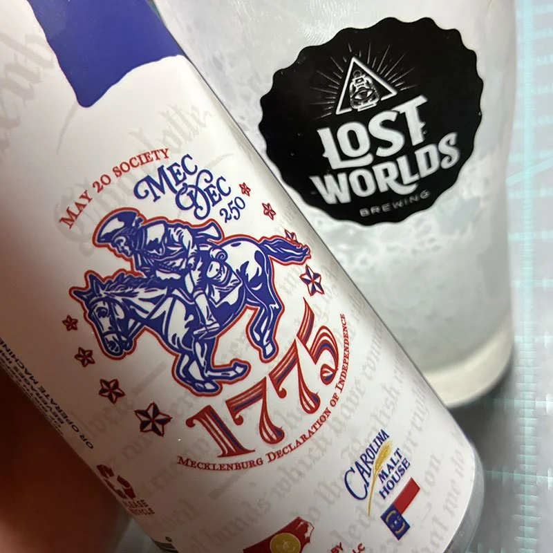
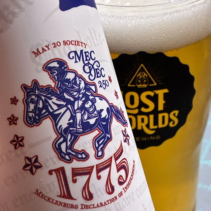

The commemorative pre-prohibition lager can wrap.

A commemorative every day carry challenge coin.
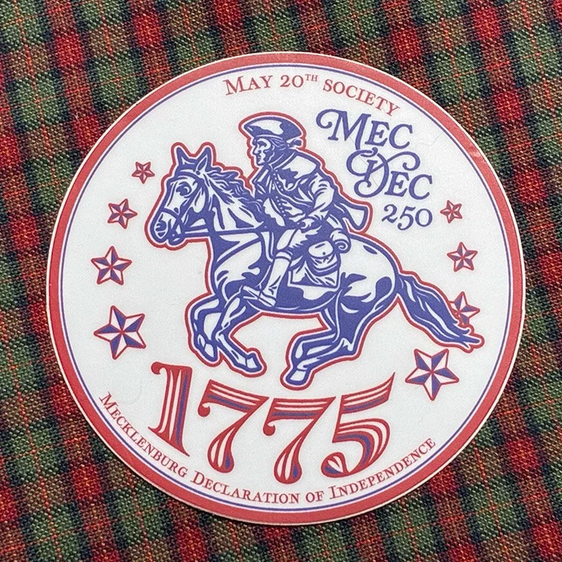
MecDec 2” Sticker
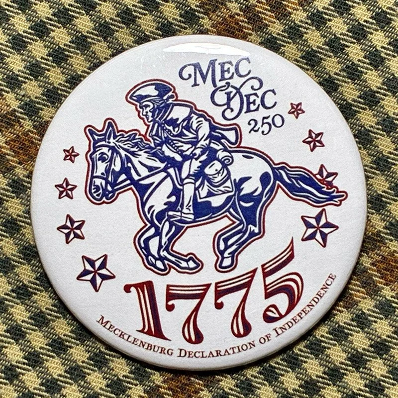
MecDec pin
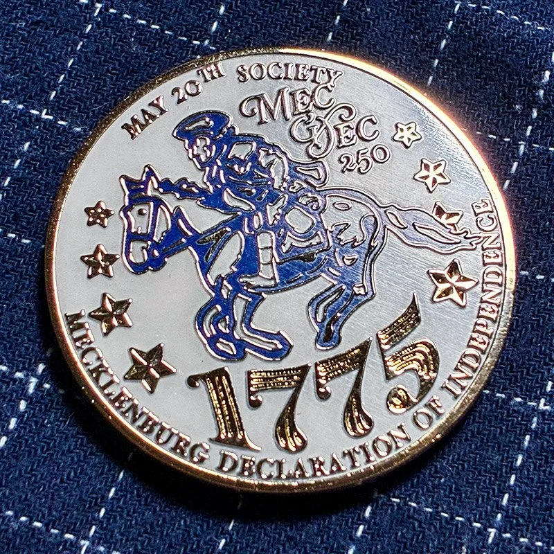
MecDec challenge coin
Wrapping Up
From early sketches to finished merchandise, this project celebrates 250 years of Mecklenburg County history through illustration, typography, and thoughtful design. A single mark—rooted in local heritage—becomes a flexible visual system that connects past and present in a meaningful, memorable way.
