
Illustrator Ink Effect and Morphing Type
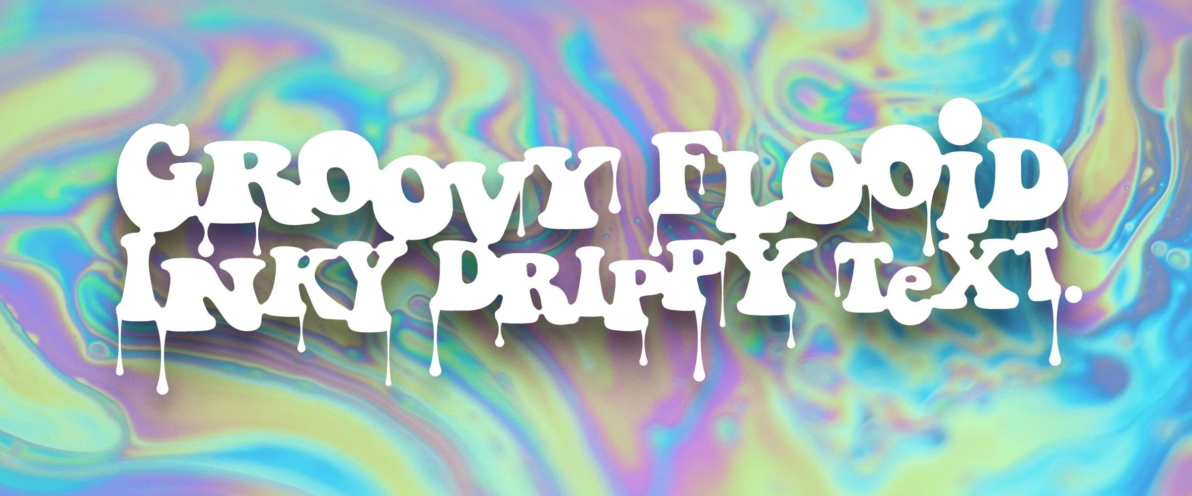
Overview: A simple tutorial for creating fully editable fluid, inky text effects in Illustrator using compound shapes and offset paths.
What you’ll learn
There are lot of destructive and labor intensive ways to do this inky fluid text effect, but here’s a simple method that is fully editable with a few tweaks in the Appearance panel. This tutorial is fairly simple, and is a nice primer for the Appearance panel if you’re a newcomer to Adobe Illustrator.
1. Start by writing a line of text
Grab the type tool and write out your desired text; it can be a single word or a full sentence. Smooth forms tend to look best, so I’ll be using this free font called Keep On Truckin from Dafont because it looks kind of groovy.
2. Make your text a compound shape
With your type selected, open the Pathfinder and select Options > Make Compound Shape. This allows the text to behave like one large, simple shape, but will still be fully editable type. It’s a good starting point for all text effect manipulation; a lot of layered effects require this.

Write your word(s) of choice in a bold font.
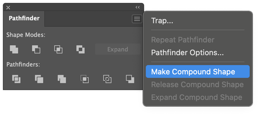
Turn that text into a compound shape.
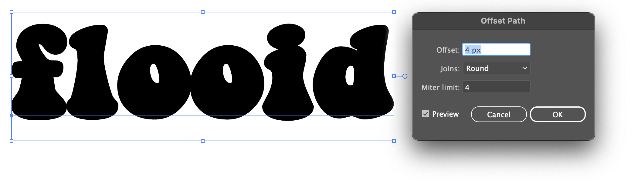
3. Add an offset path effect
Go to the Appearance panel and add the Offset Path effect to the compound shape.

For the Offset Path settings, choose something like 4px-8px, and set the Joins to Round. This makes the shapes thicker, and the rounded join will make letters connect smoothly. The larger the number, the farther away the fluidity occurs, and the more ‘gooey/sticky‘ things become.
If the values are too big, the letters start filling their counters and close the letterforms altogether… like the hole in the d… the d-hole… it will vanish. Nobody wants a vanished d-hole.
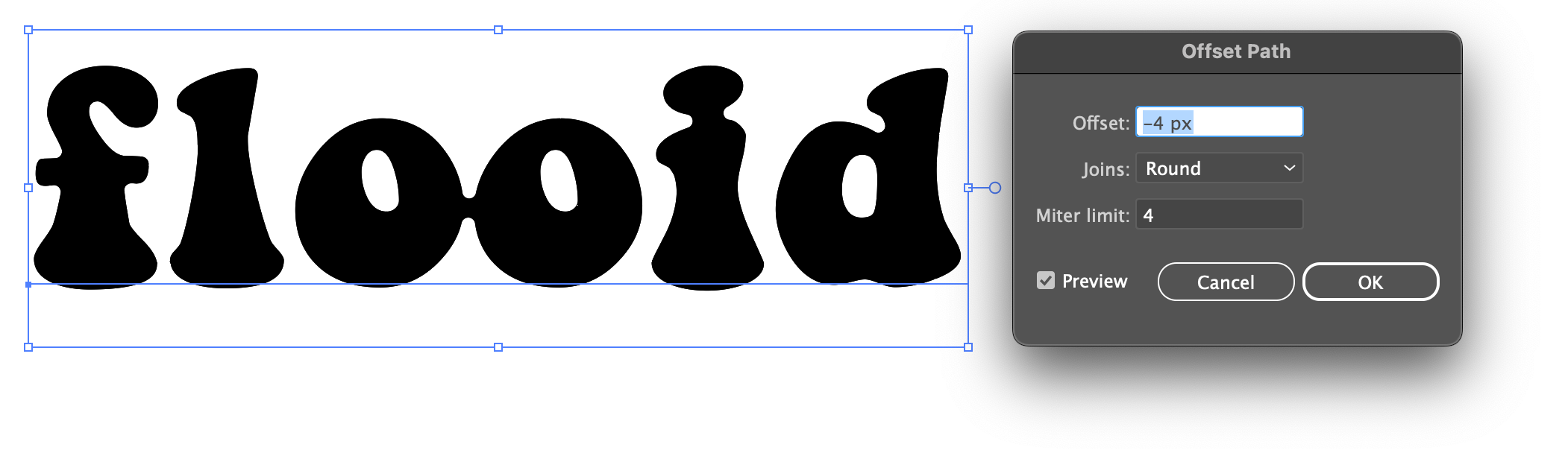
Add a second (and opposite) offset path
Now add a second Offset Path effect. An alert will appear saying you’ve already got one. Ignore the message and apply the new effect because we know what we’re doing. Offset Path is doing 90% of the heavy lifting here, so let it cook.

Make the offset value the opposite of the first; my first path was 4px, so this will be -4px. As long as the numbers are opposite each other everything will work as expected. Depending on your font and Offset Path settings, you may notice characters starting to stick together like the two Os below.
It’s easy to come back later and experiment until you’re happy with how it looks or try a different font altogether.
The finished appearance panel settings
The Appearance panel will ultimately look like this (the Offset Path order is important). This panel is a non-destructive FX wündertab; stack as many effects as needed. Experiment with the positive offset and negative offsets. Try a -6px offset (or more) and watch the goopy connections thin out a bit.
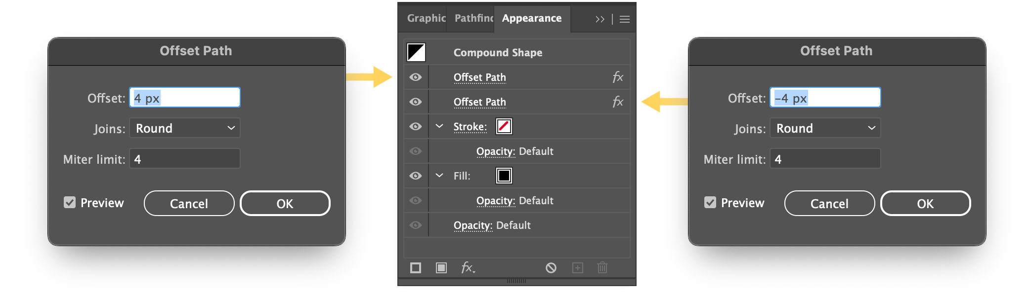
Order is important; the positive offset should be on top and the negative offset underneath. Try a larger negative like -6px to thin out the goopy connections.
4. Adjust the text with the Touch Type Tool
Finally, adjust the individual letter placement using the Touch Type Tool to make some delicious ooey gooey text. If the Touch Type Tool button is not visible in the character panel, enable it under the Character options menu.
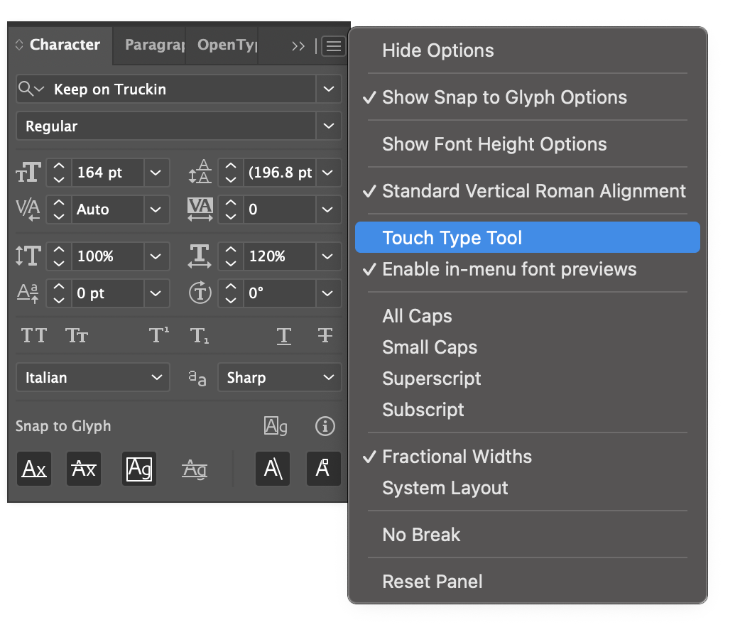
The Touch Type Tool is in the options menu.
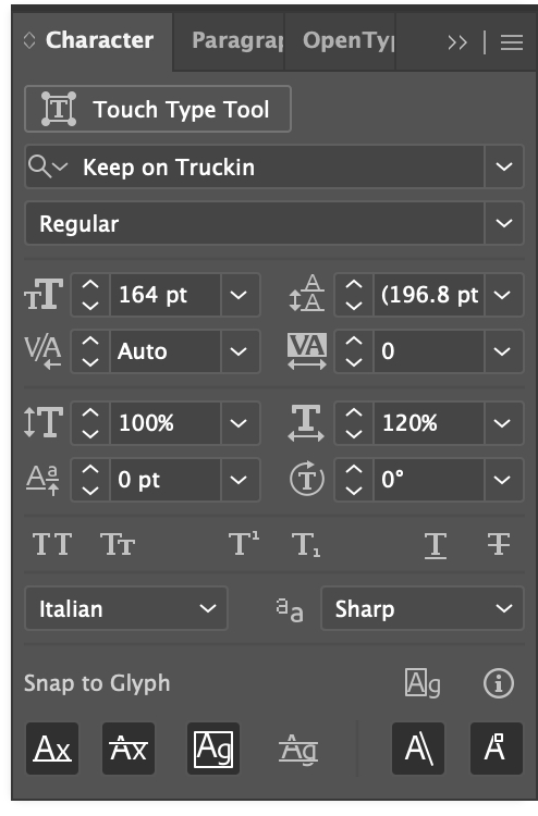
Edit the letter positioning to your heart’s content and make it as spicy as you like. The closer each letter is, the thicker the bond. Add a gradient, colored stroke, or some obligatory drips using strokes. Experiment until all your fancies have been tickled.

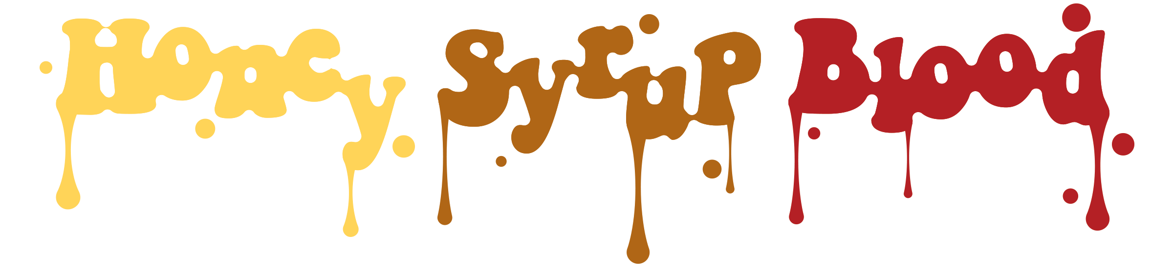
5. Add hand-placed drips
With very little effort and some hand-placed drippy lines, the finished text comes together quickly. And it’s all still editable text. There are endless layers of effects one could add to really build these up!


Wrapping up
Thanks for reading! I have an entire bucket of these quick Illustrator tutorials that I’ve never bothered writing until now, out of sheer indignation over the countless cringey design influencer videos that keep crossing my feed.
“What do you mean I have to watch this excessively overacted facecam pantomime again because step 19 is confusing, menus are too fast, I didn’t catch the filter name, everything is too small, the song is bad, there’s no video controls, and… oh, I already know how to do this because you’re making it harder than it needs to be. Lovely room though; I like your neon sign. I only have a lava lamp. But don’t think I didn’t notice your high engagement influencer content with massive following and thousands of likes a bunch of “🔥” and “dope!” and “Sick bro!” comments, using some of my material worded exactly as I wrote it… you know who you are.”
I just realized who I’ve become.

Me