
Illustrator Texture Brushes

Overview
Texturing goes a long way towards making a piece feel complete; it adds a certain richness and depth. This tutorial will quickly take you through a vector illustration from beginning to end, and focus on how to create a colorful vector texture brush from scratch.
Getting Started
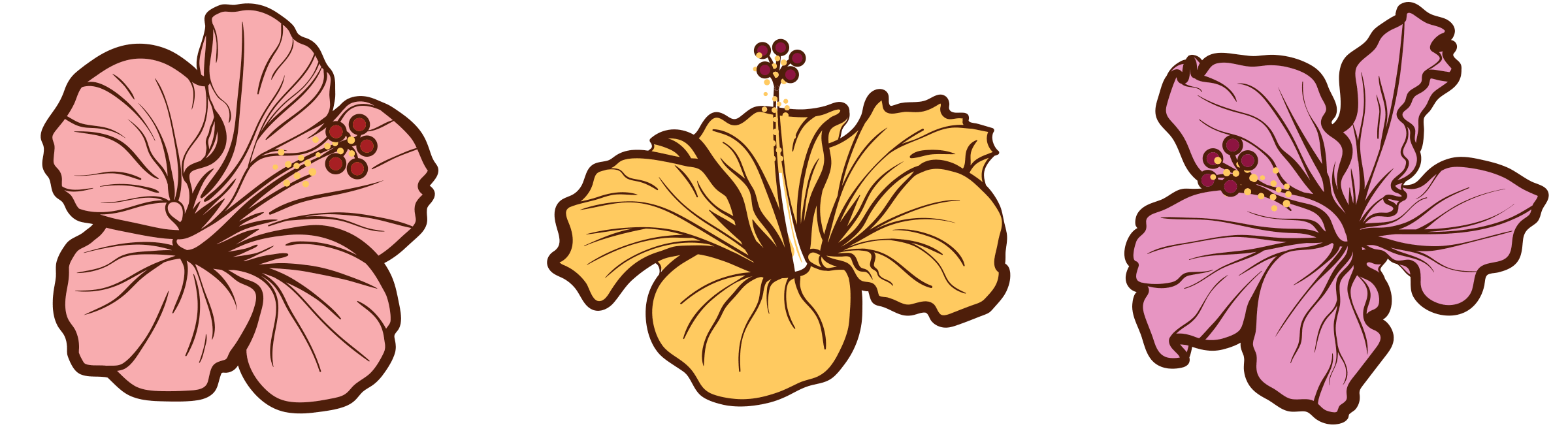
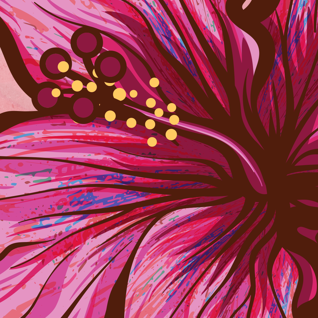
Let’s begin with a few hibiscus flowers. The line work is Illustrator’s basic calligraphy brush and a few pen lines & circle shapes. A tablet was used to draw these, and the line weights are a result of varying the pen pressure.

Blocking in Color
On a layer underneath the lines, base colors are blocked in and three additional accent colors are added using the default calligraphy brush.


Making A Texture Brush
I’ve decided to texture these hibiscus flowers with a colorful and subtle streaky speckled pattern, something that will compliment the solid colors and add interest. But rather than use photographic textures or images to give these more dimension, let’s make a quick and easy reusable vector texture brush.
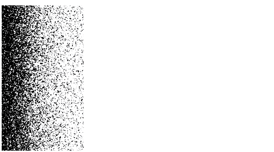
1. Start with a black & white gradient
Begin by creating a gradient filled box; black and white is ideal and easier to work with. I’m using a linear gradient here, nothing fancy, but radial gradients and freeform gradients are great too.
Use about 70% black on one end and 100% white on the other. Avoiding 100% black will ensure a somewhat loose grain and is important for the next step.
2. Mezzotint the gradient
Select the gradient shape and choose Effect > Pixelate > Mezzotint. Choose Coarse Dots from the Type menu (feel free to experiment with others). The gradient will be converted into this noisy boy.

At this stage the gradient is still editable, so the black levels can be further adjusted, the gradient handles moved around, freeform points tweaked, and so on. Once everything looks great we’ll commit the effect into hundreds of small vector shapes.
3. Expand and Image Trace the mezzotint
With the shape selected, expand the mezzotint effect with Object > Expand Appearance.
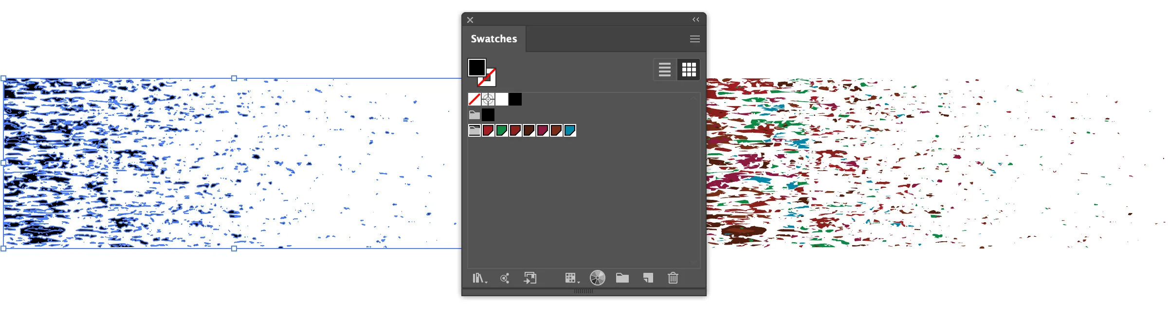
Now open the Image Trace panel and select Mode: Black and White with a combination of options that keep as much detail (or as little) as you’d like. I tend to go aggressive with Threshold: 240 (higher numbers = more subtle/light areas are converted) and Noise: 1 (even the smallest details are vectored).

If the Image Trace panel is grayed out, unselecting your shape, then selecting it again will un-glitch Illustrator 🤷
Be sure to check the Ignore White option so the result is only the black shapes (all the white will simply go away).
4. Fine tune by making compound paths & simplifying
This next step is completely optional, and is simply here to improve brush performance in larger documents. One could repeat this step several times if desired.
With everything selected from the previous step, convert the group of shapes to a compound path with Object > Compound Path > Make (Ctrl+8 or ⌘+8).
Copy and paste the compound shape off to the side, reflect it, and stretch it out a bit. Drag the new distorted copy back on top of the previous shape.
With both shapes selected, open the Pathfinder panel and Minus Front. You will be left with a group of objects once again, only less so:
5. Apply random colors
For the random color effect to work, every shape needs to be an individual piece and not part of a group (or a compound path). Select the shapes to be used for the new brush and make sure they are ungrouped (Ctrl+Shift+G or ⌘+Shift+G) and that they are not compound paths (Object > Compound Path > Release).
Download this Random Color Fill jsx Illustrator script and put in in a handy place.
With all the shapes selected, open the Swatches panel and Ctrl+click (⌘+click) as many color swatches as you’d like to randomly apply to all the shapes.
Run the random color fill script: File > Scripts > Other (and locate the file). All those noisy pieces should now be very colorful. Sure beats selecting each shape manually and selecting a color, no?
For performance reasons let’s keep things small & tidy. The noisy gradient above is rather big, so I’ve selected a smaller grouping of shapes going forward. The larger/more items you have selected, the larger the brush will be at a 1pt size.
Note: If they all turn the same color, or the random color seems broken, go back and make sure everything is ungrouped and not part of a compound path. The script can be run as many times as you’d like to further randomize.
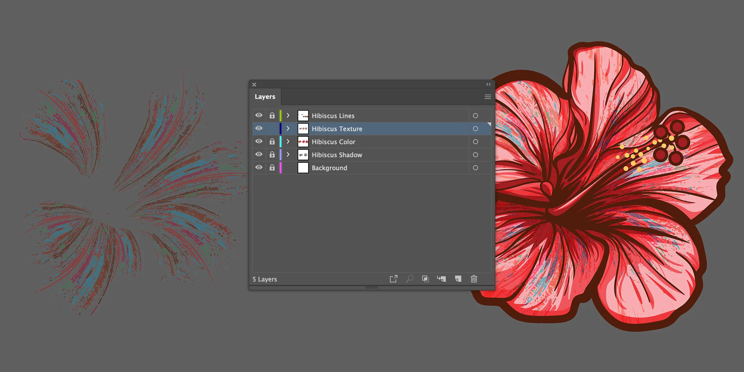
6. Create the brush
The final step is to simply select all those colorful noise shapes and create a New Brush form the Brushes panel. Choose the Art Brush option. This flavor of brush will stretch your textures from beginning to end, regardless of line length.

The following settings are defaults, but be sure to play with them to find a combination that suits you. These can also be changed later and will update any lines that are already placed.


Applying The Texture
To complete the floral illustration, use the newly created texture brush to add a stroke on top of each petal. I tend to keep my layers organized with lines on top, colors underneath, and textures between the two.
Experiment with line thickness, tapered shapes and widths, blending modes, and opacity. See below how the custom brushes are tapered and slightly transparent, and the blending mode of each is set to hard light.


Wrapping Up
With a little experimentation, one can quickly build up a large library of various vector texture brushes using nothing more than black and white gradients, simple filters, and a selection of colors.
If you really want to get nutty with custom brushes and layering, be sure to check out my other tutorial on masking brushes using Illustrator’s Draw Inside mode.
Thanks for reading.