Create a Simple 3D Contour Letter in Illustrator
Overview: This step-by-step, medium difficulty tutorial shows how to create an isometric ribbon‑style 3D letterform in Adobe Illustrator.
What you’ll learn
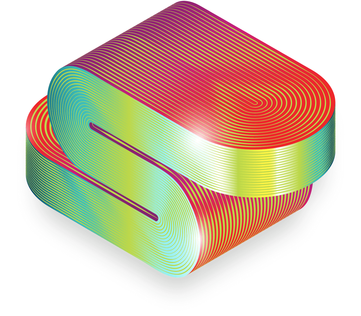
Want to create a smooth, ribbon‑like 3D letterform in Adobe Illustrator, with sexy curves, isometric style, and a contoured metallic sheen? Seems easy, right? I saw this on Reddit and took a crack at it. There are several ways to achieve the effect, but we’ll focus on the method that I feel is the simplest, most flexible, and easiest to adjust.
This approach uses blended strokes with adjustable profiles for the surface contours, a simple isometric 3D extrude for the letter, some shape builder love, and a few downloadable isometric actions to help. Precision is required, so it’s a little more advanced, but this walkthrough should deliver the cleanest, most controllable results without relying on actual 3D software.
1. Getting Started
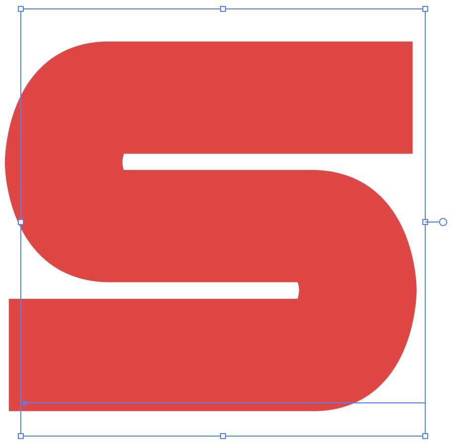
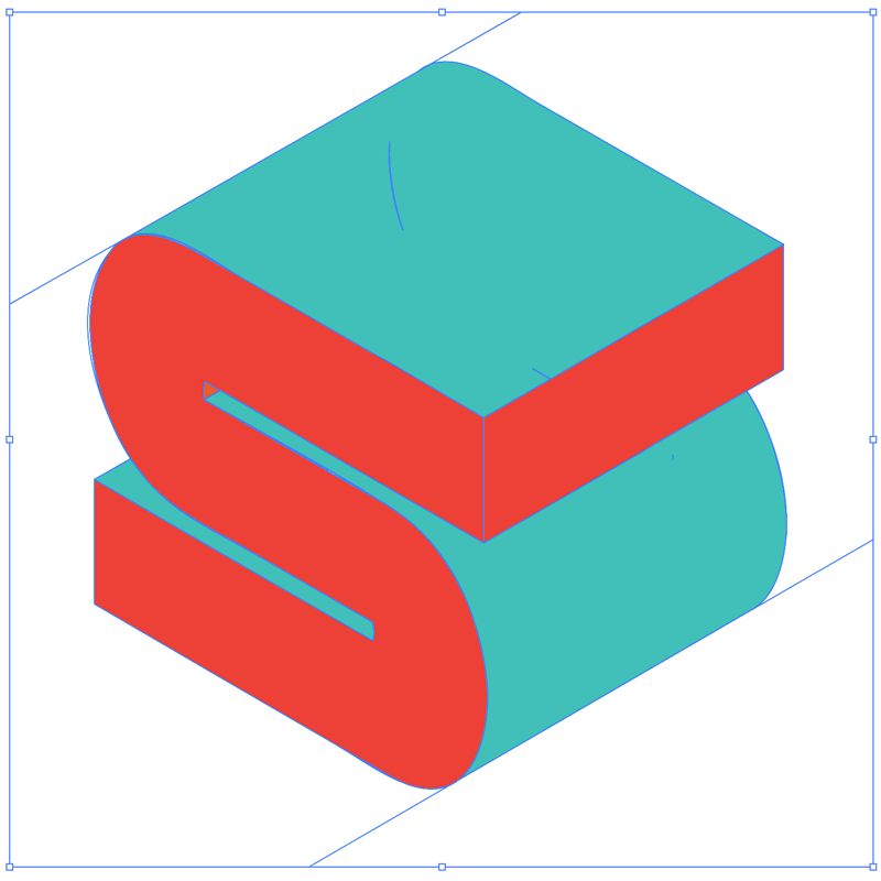
This effect can work with any letter—though the ideal form is something thick and smooth with a lot of surface area—so a chunky letter with clean lines is perfect. I’m working with the letter S from the BD Nippori font family.
2. Create the 3D letterform
From the 3D and Materials panel, apply the Isometric Left type to your letter. Experiement with the font face, weight, and thickness, or add an outline to make it even thicker. Color doesn’t matter, neither do the materials and lighting. 3D is simply being used to generate a usable, isometric shape.
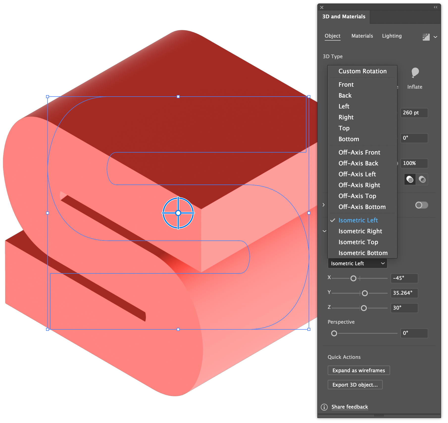
Isometric forms are easiest to work with, primarily because this style of 3D is easy to build upon without the need for actual 3D. Using isometric perspective keeps the geometry predictable, which makes blending and contour alignment far easier later.
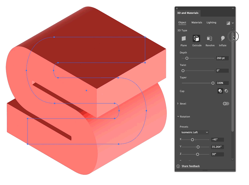
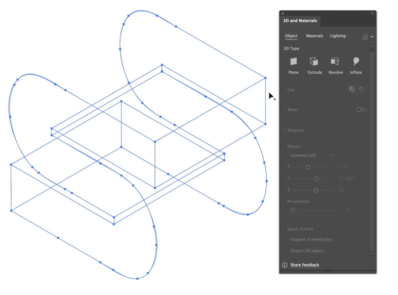
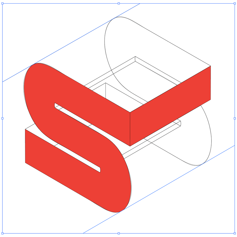
Once the letter styling looks good, expand the 3D object into a wireframe and use the Shape Builder (Shift+M) to combine the various visible faces into solid shapes.
Refine the letterform surfaces
With the base geometry established, continue refining the letterform by adding tangent lines to close any large holes, like the top and front surface of the S. Fill those areas using the shape builder as before. Illustrator has a nasty habit of making excessive points and garbage vectors, so take a little time to clean up the line segments and other pieces that aren’t needed.
Add tangent lines as needed to close areas.
Use shape builder to fill the remaining surfaces.

Select each surface with the direct select tool and lock it.
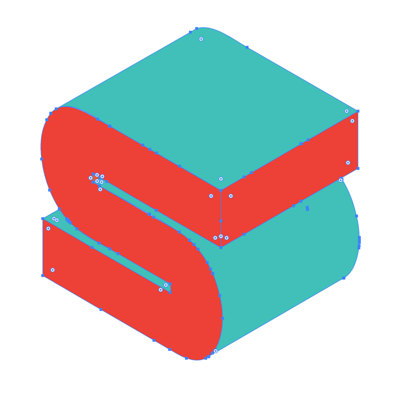
Remove all the excessive, non-surface lines.
The greatest custom keyboard shortcut
To speed things up, the single greatest custom keyboard command one could make is for Removing Anchor Points. Normally only available in the Object > Path > Remove Anchor Points menu, or as a pen tool single-click action, this will remove large amounts of points with a keystroke while maintaining the shape’s integrity.
The typical Illustrator experience for newcomers is how do I remove all these points without breaking my shape? One cannot simply hit delete, and using the pen to remove each point is tedious:
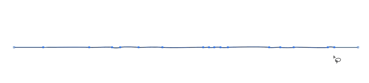
Selecting multiple points and hitting delete breaks the shape.
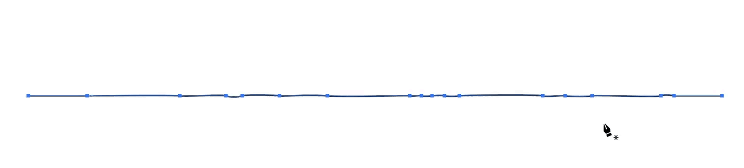
Using the pen tool to remove points one by one is a tedious affair.
The Remove Anchor Points custom keyboard shortcut is found under Menu Commands. I like to overwrite the show/hide ruler keyboard shortcut, because who really toggles that often enough to need a shortcut for the ruler?
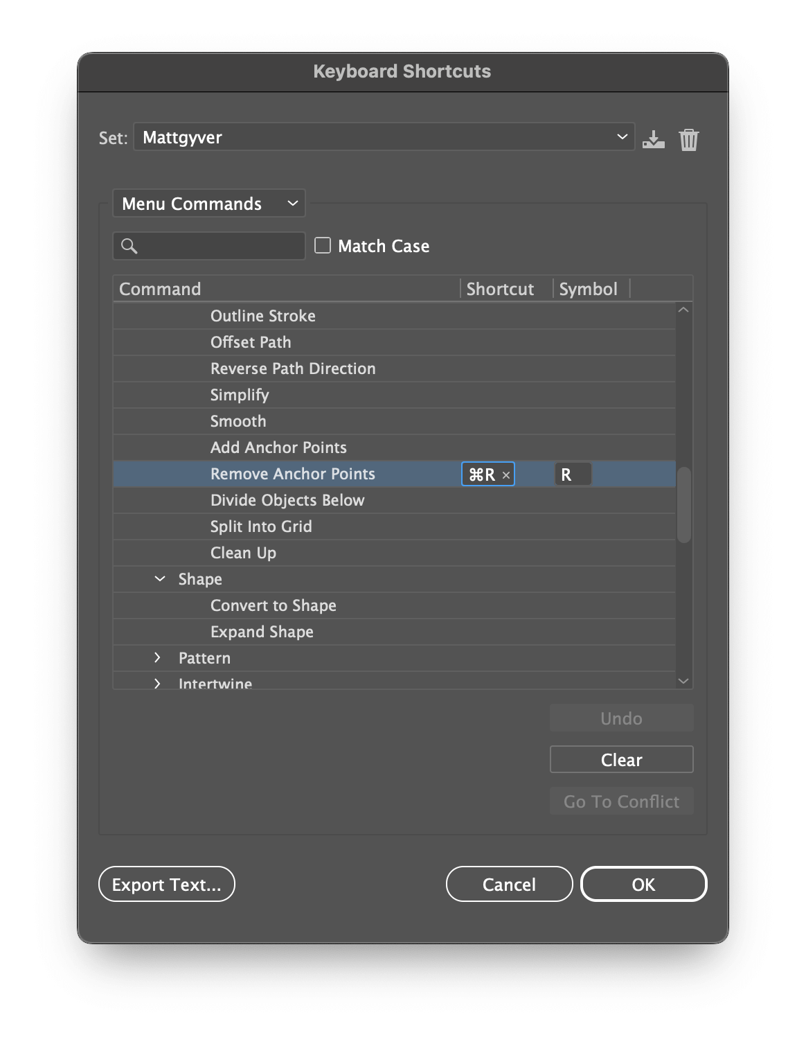
Add a custom keyboard shortcut for removing anchor points.
The new point removal experience is quick and fast—no menu needed. Lasso all the points and simply Ctrl+R (⌘+R on Mac).
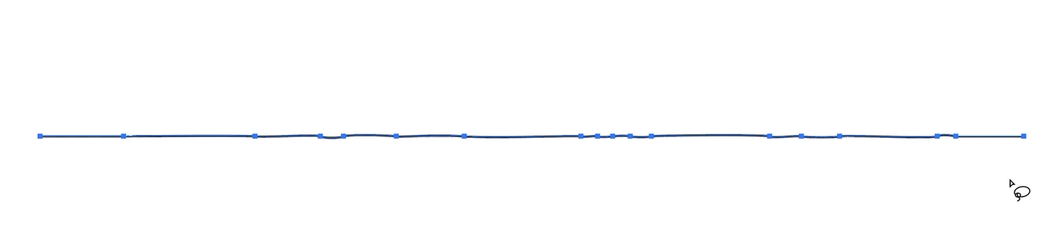
Add a shortcut for removing anchor points.
3. Isometric shapes
Now that our surfaces are clean and presentable, let’s modify things further by rounding out select flat surfaces with a more continuous rounded edge.
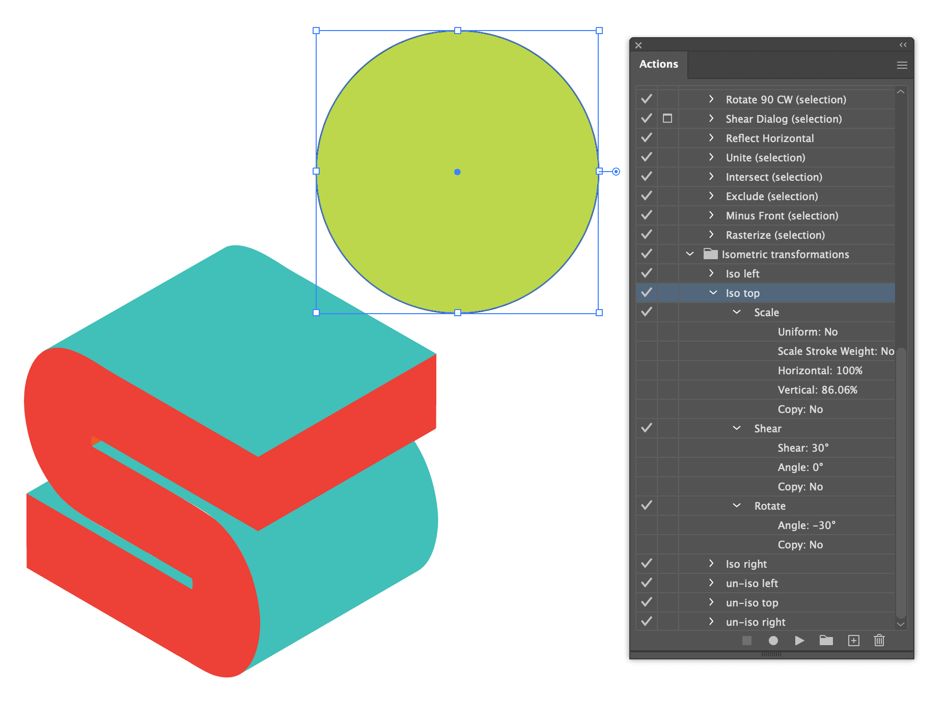
Instead of wrestling with Illustrator’s 3D tools again, here’s a downloadable set of isometric actions from Dribbble user Dario Stefanutto that will transform any shape into an isometric perspective.
For my letter, I’ll add a round nose and tail to the S by transforming a circle using the Isometric Top perspective action from the actions above.
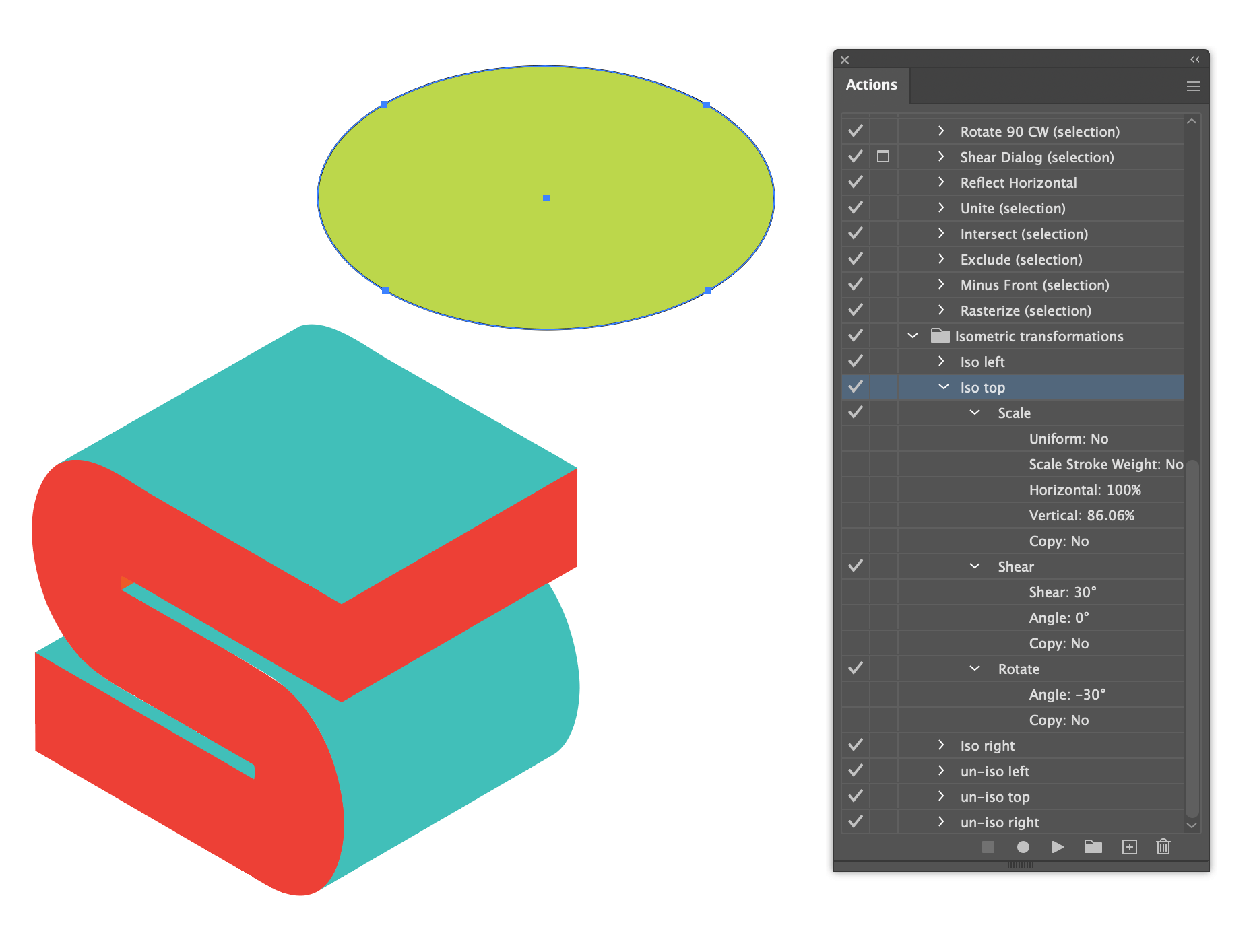
Once the circle is transformed, split the shape into two halves and match the corners with the main letterform surfaces. Scale these two pieces to fit, making sure the corner points meet, and close the shape with tangent lines. Use the shape builder to connect and fill the surfaces, and simplify every surface down to large, single areas.
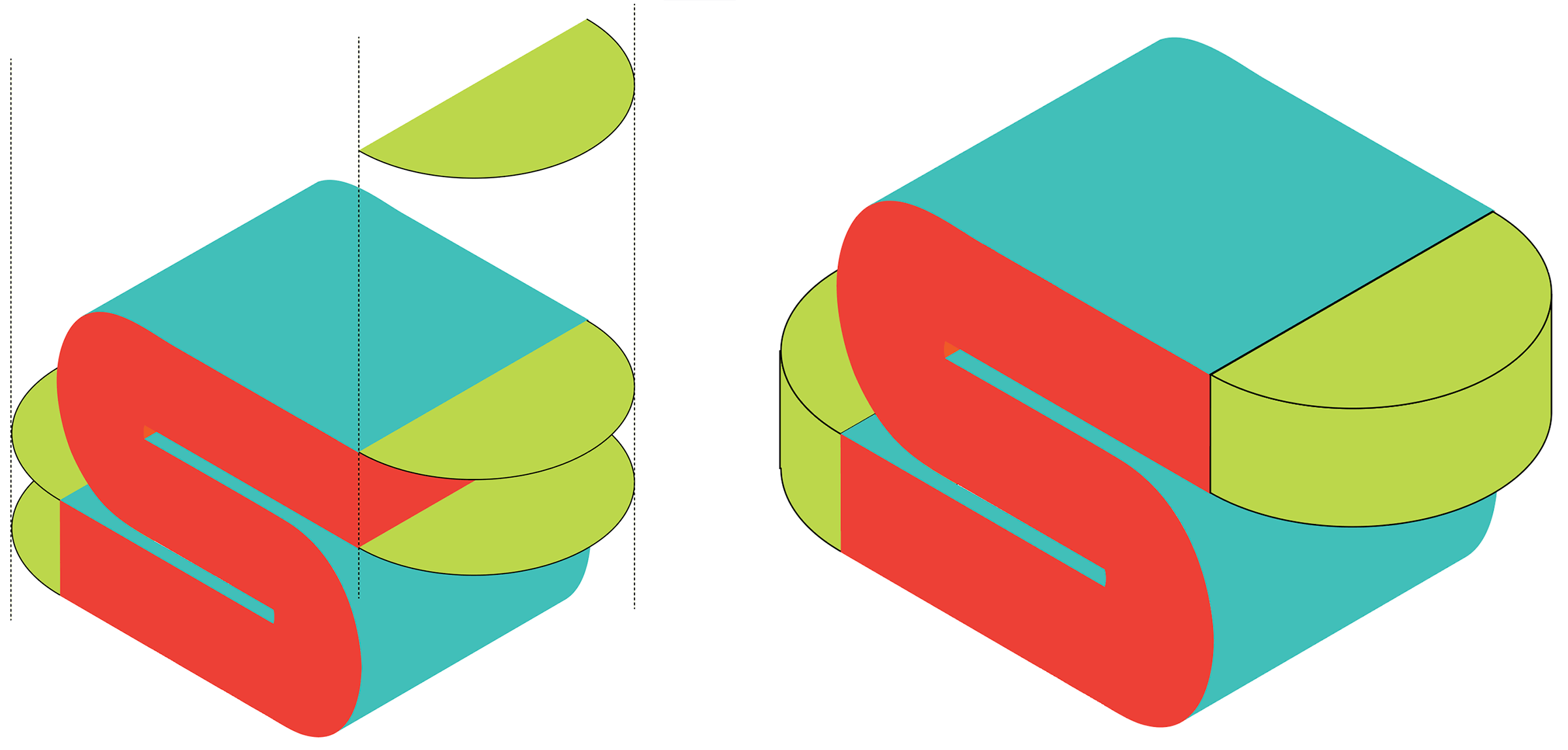
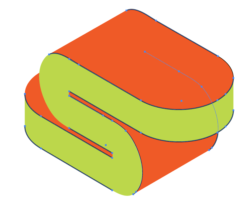
At this point, your isometric base shape should be clean, simplified, and ready for contour work.
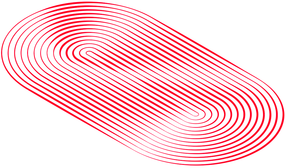
4. Contour Lines
Now it’s time to add the sleek surface details and contours.
Find an area with equal, parallel sides. Surfaces like the top, parts of the front surface, and any parallel rounded contours are all candidates.
Direct select two parallel edges (you want the line segment) and copy/paste them on top of the shape (Ctrl+F or ⌘+F).
Change the line to black or whatever color will be visible against the shape.
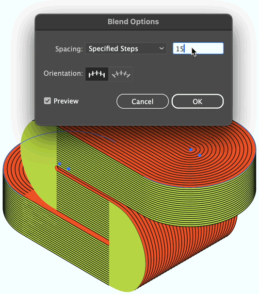
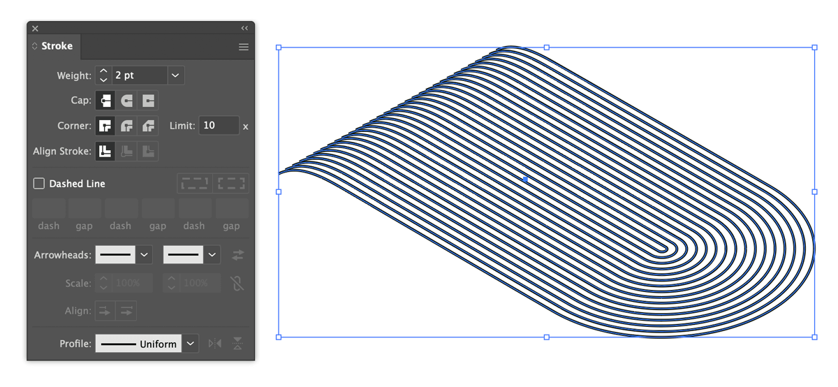
With these two parallel lines selected, apply a blend with Object > Blend > Make (Ctrl+Alt+B or ⌥+⌘+B on Mac). Use Specified Steps and pick a value that speaks to you.
Here’s how the top might look:

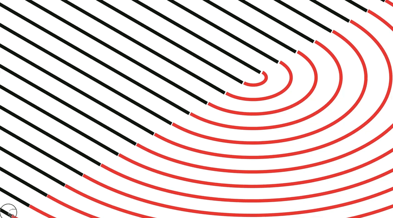
Repeat the process and make blends for each area that has parallel sides. Here are all the completed faces with blended lines:
Blending the rounded shapes
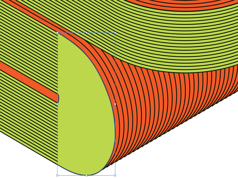
To complete the surface contour lines, the rounded end caps need a slightly different approach. Create a circle with a smaller circle in the center and blend the two shapes together. A series of concentric rings will appear. Because our letter needs a front and back rounded shape, I’ve split my blended circle into two halves.

To make these two halves precisely fit the shape, apply the isometric top action and it will transform them into the correct perspective.
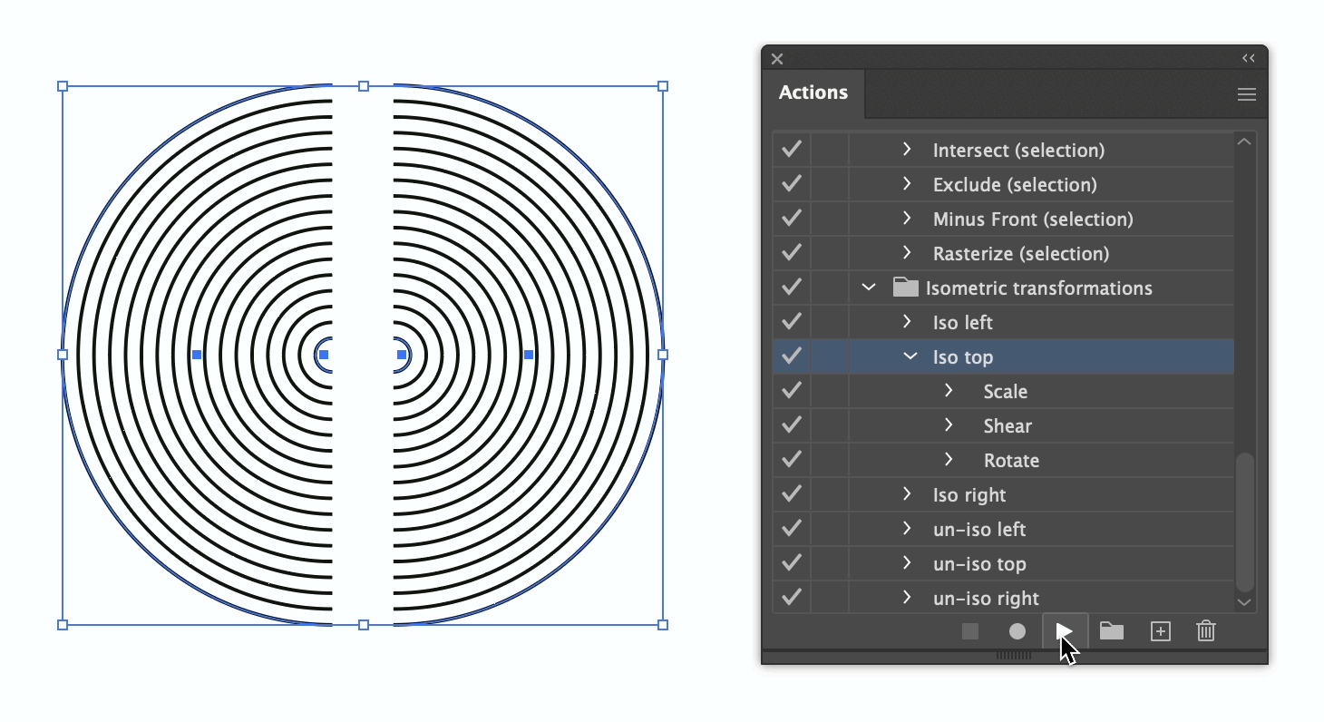
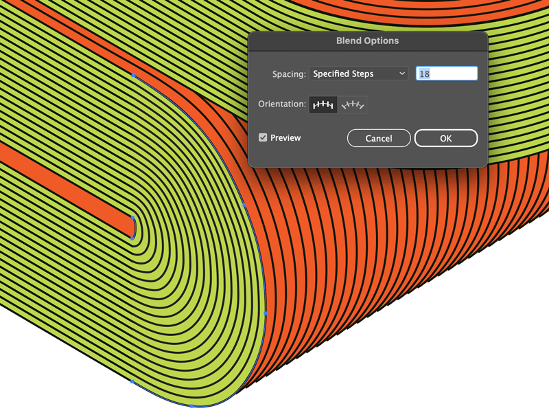
Slide these into position, adjusting the scale and layer position as needed to fit and change the blend steps to match the nearby surfaces. We will be joining these together soon, so the lines need to match. If the end cap blend never quite matches, change the parallel surface blend steps to one more or one less. The formula for the end cap blend is half the surface blend minus two—but just noodle with it until it matches.
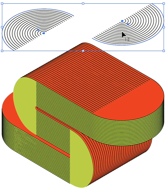
Repeat the process for the front and rear curves, applying the isometric left action if you want, or simply use the outermost curved edge and the innermost curved edge to create the blend group. All letters are different, so it’s helpful to stick with the actual shapes and tweak if needed. The small, innermost rounded edge, needs a little finesse to smooth out the curve.
5. Joining the surface contours
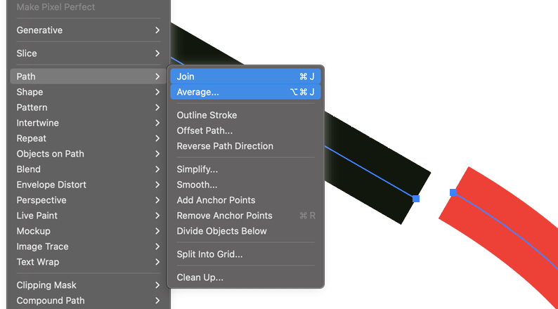
Once everything looks good and is mostly seamless, Object > Expand… each blended line group to turn everything into individual lines.
The second greatest keyboard shortcut
Start connecting these end points by selecting neighboring pairs and use a combination of Object > Path > Average and Object > Path > Join. But instead of menuing or doing two separate keyboard shortcuts, this unlisted keyboard combination performs the average action and join action in one go: Shift+Ctrl+Alt+J (Shift+⌥+⌘+J on Mac). Mash those keys and you’ll never need the menu again.
Both actions are performed at once by holding shift.
Average and join each path’s endpoint quickly using the combined keyboard shortcut.
Work through each face, joining each neighboring pair of points until all the of the surfaces are completely contoured.
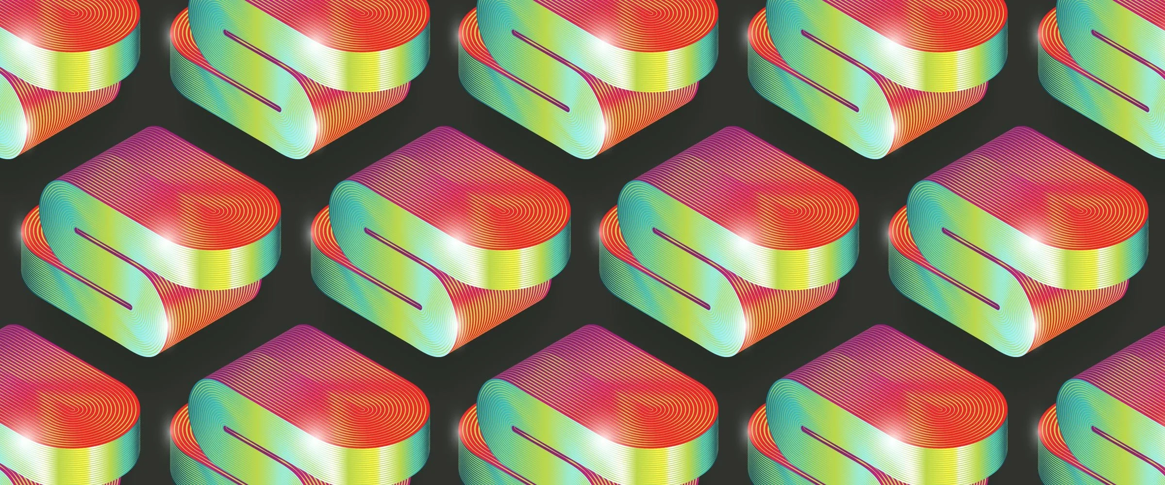
Make it shine
The importance of having large groups of interconnected surface contours will now become apparent. By changing the stroke Profile to something other than uniform, the continuous surface contours begin taking on a variable thickness shine.
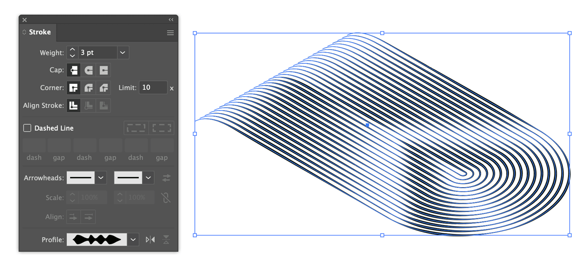
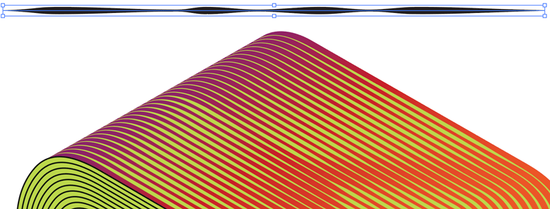
Experiment with profiles and create your own custom setup. I find the best results are when the middle of the line has a few wavy bits, and the beginning and end point of the line are the same size and—this allows the lines to repeat themselves seamlessly when touching end to end.
6. Fine tuning
To finish the design, play with color and gradients on both the surface faces as well as the contour lines, adjust the line thickness, maybe add a drop shadow, use some subtle grain filters, and even add a lens flare or two.
Try more shapes and letterforms
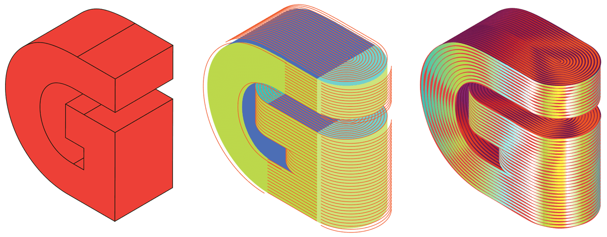
I had varying degrees of success with other letters, but the process holds up well enough. Break the surfaces down into distinct areas and deal with it one face at a time. Here’s a letter G that mostly works, but the various lengths of line made the profiles difficult to match; it needs a rethink on how to handle the loop/chin for a more smooth look.
Wrapping up
Setup is everything; get the isometric letterform looking right, understand the complexities with how it might wrap around itself, and have a go at simplifying the shape as much as possible. Actually, the real star of this article are the two keyboard shortcuts; my custom one for removing anchor points and the hidden one for averaging/joining lines in one stroke. If I had a nickel for each time I used those I’d have bought the moon by now.
I hope this was a nice little excursion into the 3D and isometric world of Illustrator, and thanks for reading!