Ink Effects and Voronoi Blobs in Illustrator
Overview: A fast, four‑step workflow for making customizable Voronoi-like blob shapes in Illustrator using only a few built‑in effects.
Well, akshually 🤓 not technically a Voronoi structure, I’ve also seen this called a Turing pattern, reaction diffusion, or even an ink bridge effect.
What you’ll learn
If you’ve ever wanted to create those fluid, cellular, Voronoi-like blob shapes in Illustrator, here’s a quick four‑step tutorial using a handful of native effects that keeps things simple and non-destructive—and ready to customize for branding, backgrounds, posters, and abstract compositions.
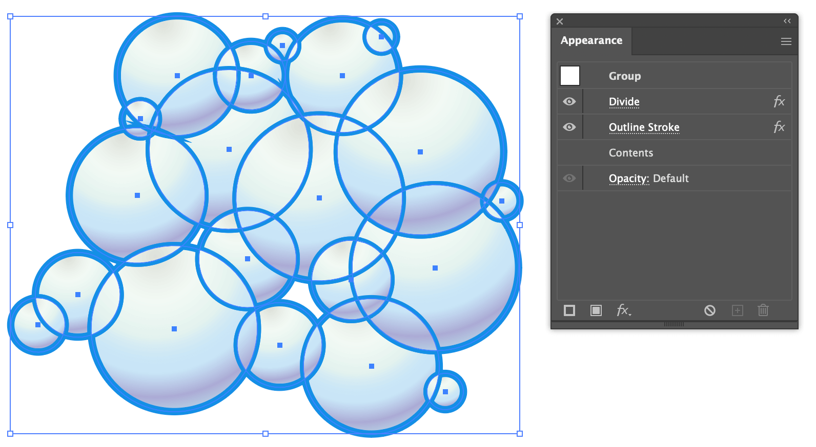
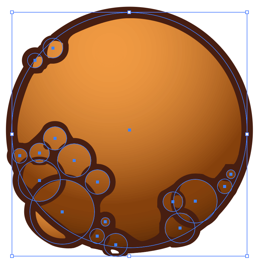
1. Create shapes and group them together
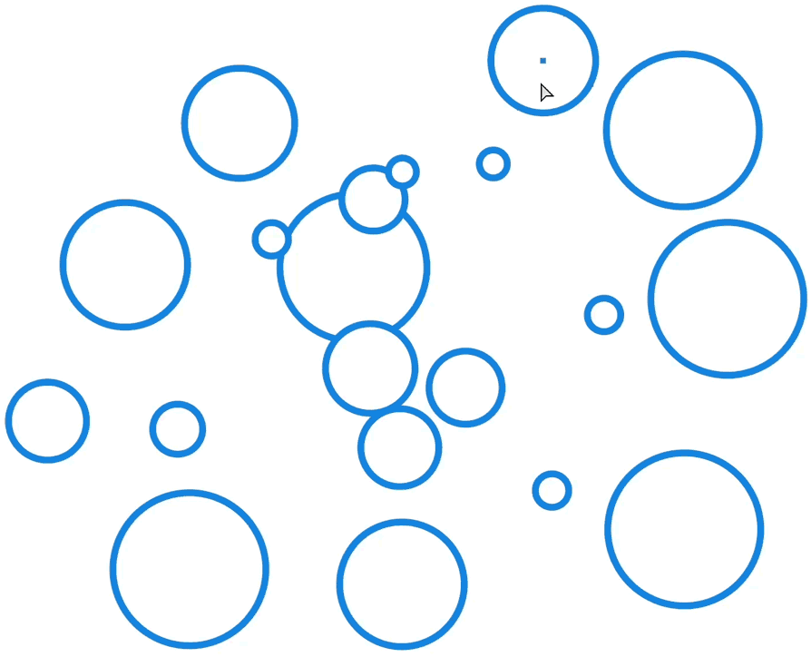
Get started by creating a collection of shapes with simple strokes and fills. I’m using circles which should achieve a soapy bubble effect when finished.
Arrange the shapes so they overlap, then group everything together with Ctrl+G (⌘+G). This entire process is non-destructive; everything will be adjustable later. No need to get too precious with placement here.
Color tips
It’s important to have only one stroke and one fill per shape; don’t get fancy with stroke profiles, multiple strokes, or brushes.
However, the shapes can be filled with solid colors, transparent fills, gradients, and each shape can have a different stroke thickness. Experiment with thicker and thinner strokes on individual shapes within the group.
Keep in mind that solid fill colors respect line weights, whereas gradient fills collapse the shape borders into thinner lines (except the outer border). You’ll notice this once we get into the effects.
I’m using gradient fills on my circles to give a bubble-like appearance, and each circle has a 16px stroke. Here’s my starting setup—not impressive—but perfect for this effect.
Simple circles with a thick border and round gradient in each.
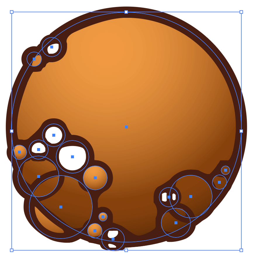
2. Add the Divide effect
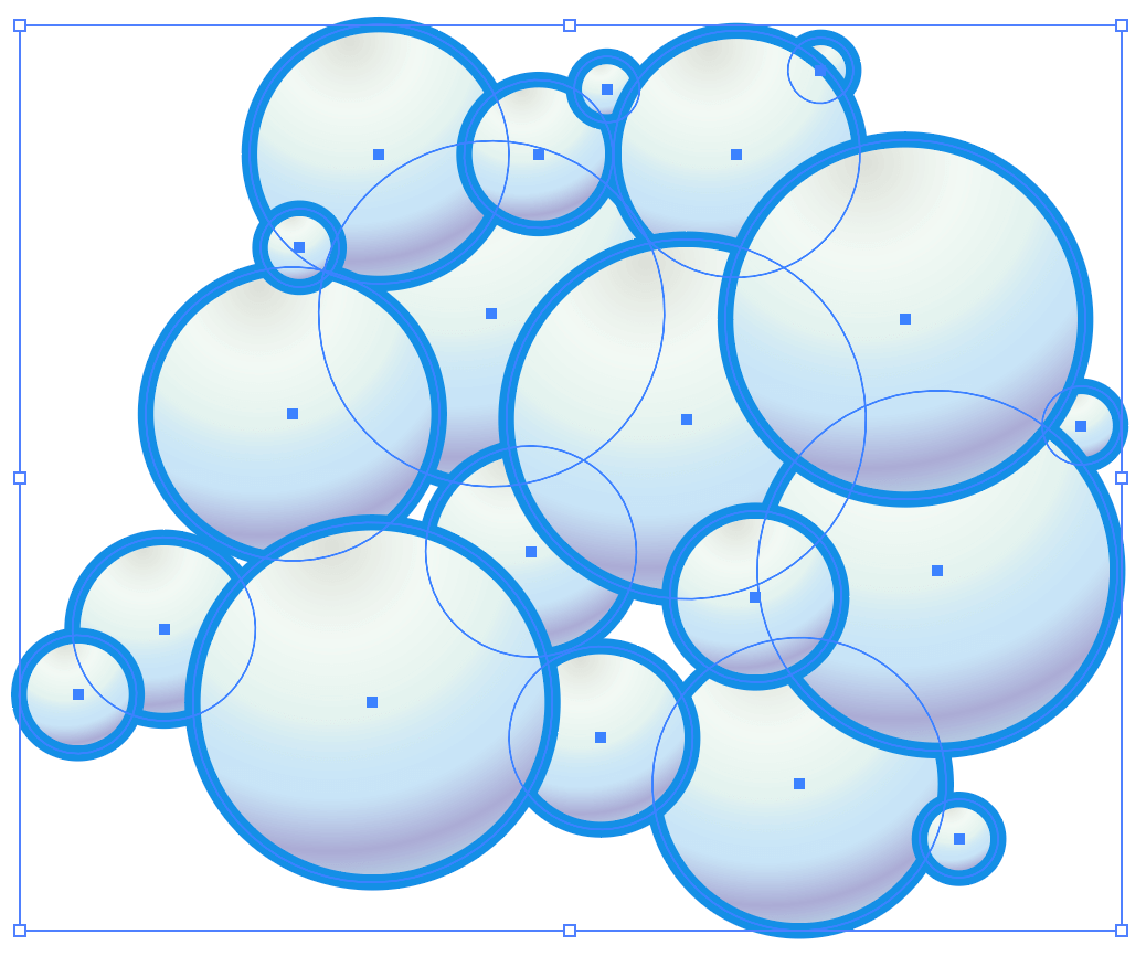
Let’s dig into the effects needed to create some soapy bubbles. With the group of gradient circles selected, open the Appearance panel and add the Divide effect with fx > Pathfinder > Divide. The group will appear to be transparent, when in actuality each shape is interacting with every other shape, creating individual cells.

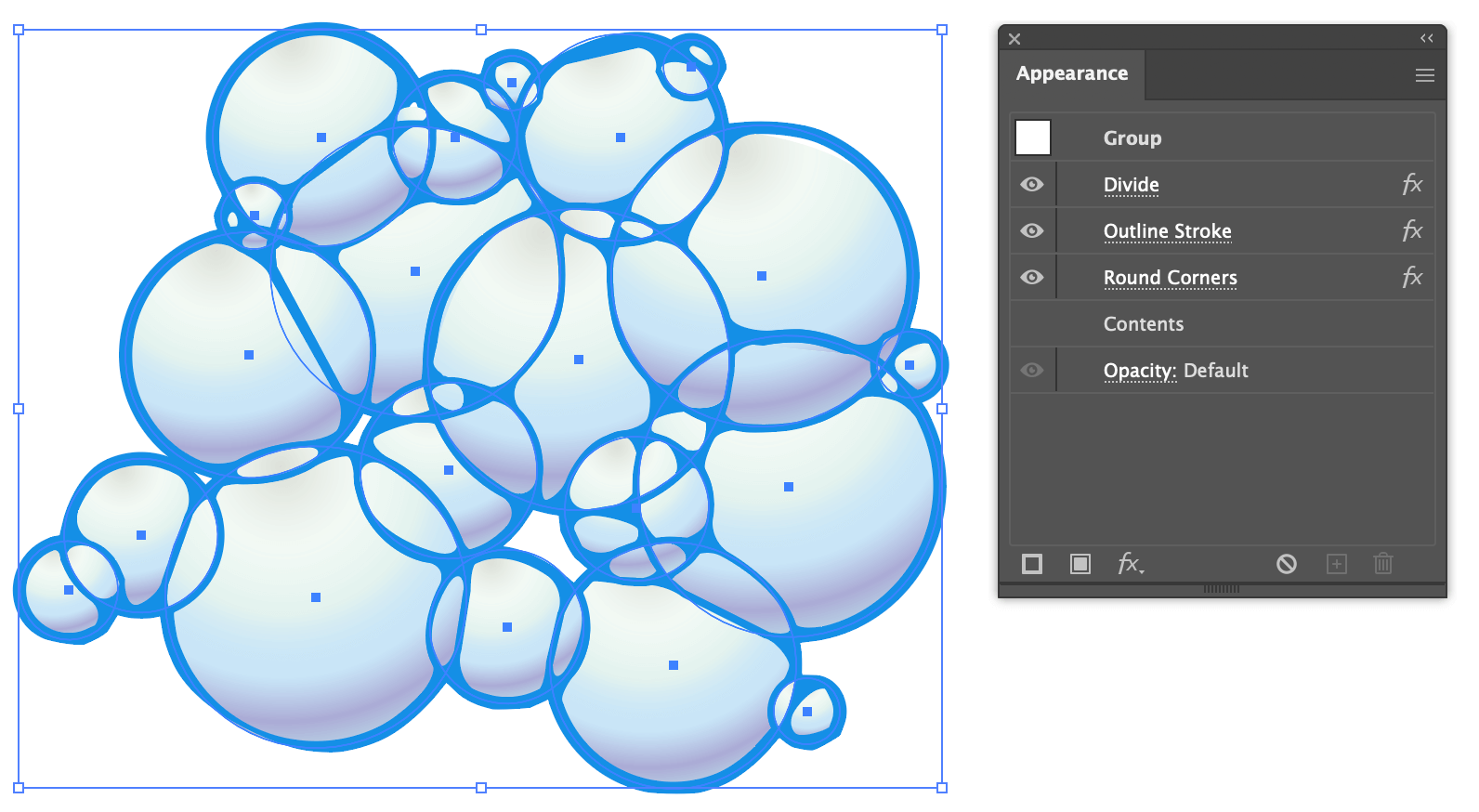
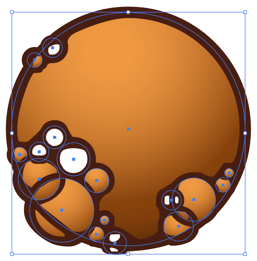
3. Add the Outline Stroke effect
Now add the Outline Stroke effect with fx > Path > Outline Stroke in the Appearance panel. This ensures the actual stroke thicknesses are used when applying additional filters and effects. You won’t see a visual change yet because this effect only prepares the strokes for the next step.
4. Add the Round Corners effect
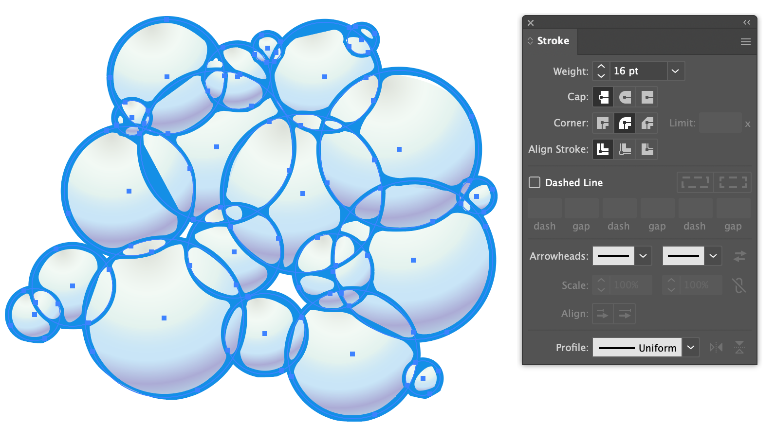
Finally, add the Round Corners effect with fx > Stylize > Round Corners. When combined with the Outline Stroke effect in the previous step, the lines will be treated as 16px fills instead of simple lines. This gives the Round Corners effect something solid to work with, and helps to thicken and smooth the line intersections.
Adjust the radius until you’re happy with it.
Pro tip
To add even more thickness, try a Rounded Corner Join instead of a Miter Join. This gives various line segments a bit more beef. Mmmm. So thicc.

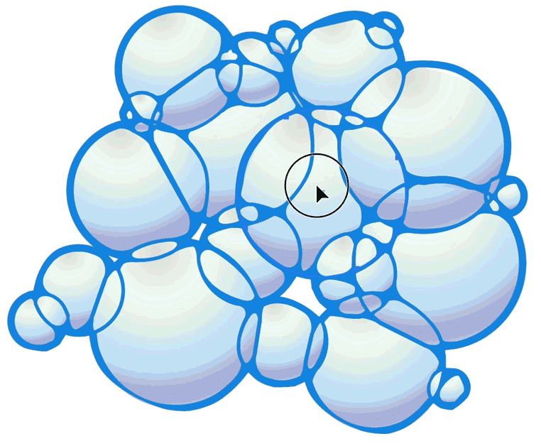
At this point the effect is basically done. Note that it’s still fully editable 🔥 and requires no effort to reposition, add, edit, or delete pieces. The effect stack is even lightweight enough that the visuals are updated real-time when repositioning the shapes.
Stacking order makes a difference
Stacking order makes a difference, especially when fill colors are different. Because the shapes are using the Divide effect, the intersection of shape boundaries will split in predictable ways, but the fill colors will still respect the stacking order.
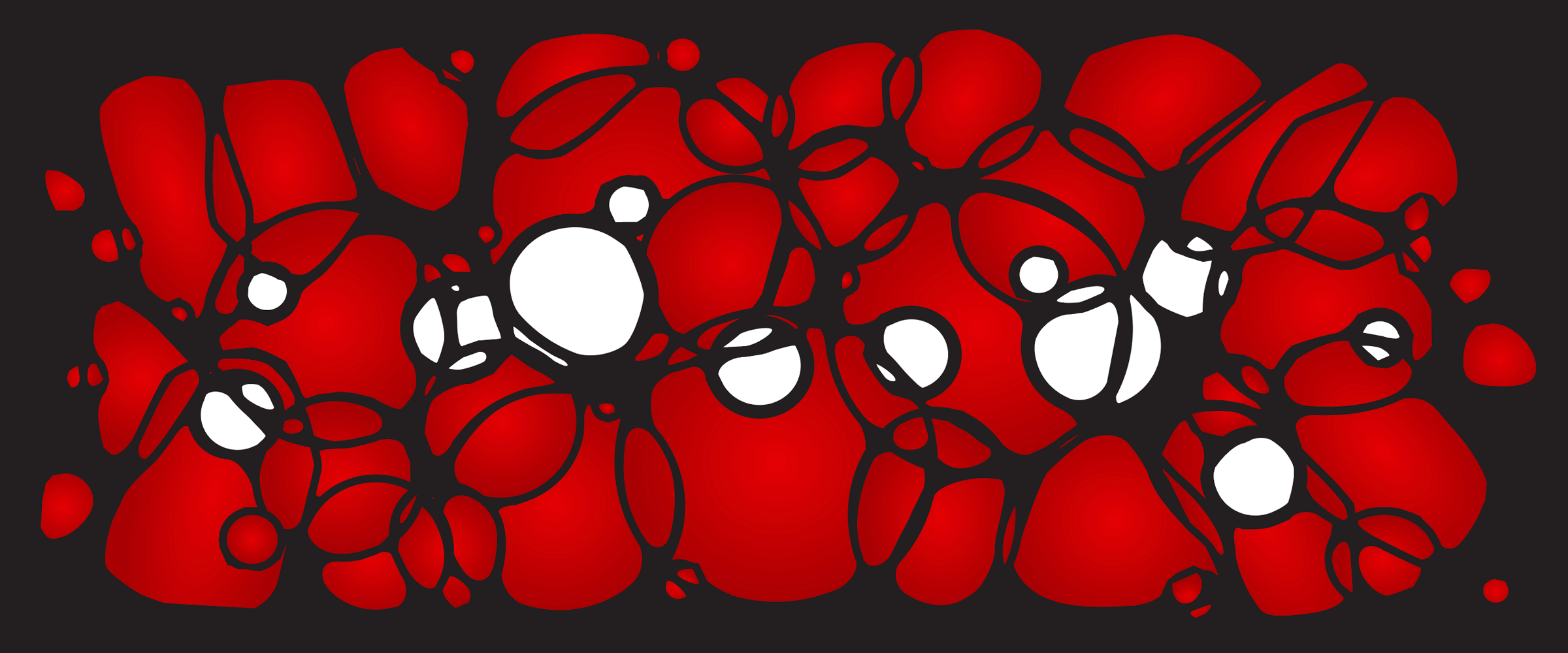
The large central ring in this next example begins as the topmost layer, and is gradually moved to the bottom of the stack, permitting the other shapes’ colors to appear.
Line thicknesses also change slightly, depending on which shape is on top and stacking order. Try various weights on different shapes to experiment and fine-tune the overall look.
The large center ring is on the top layer.
The white bubbles are on the top layer.
The large central ring is on the bottom layer.
Additional effects to try
This last example is simply a larger collection of odd shapes and overlapping gradients. Every piece can be manipulated and moved as needed.
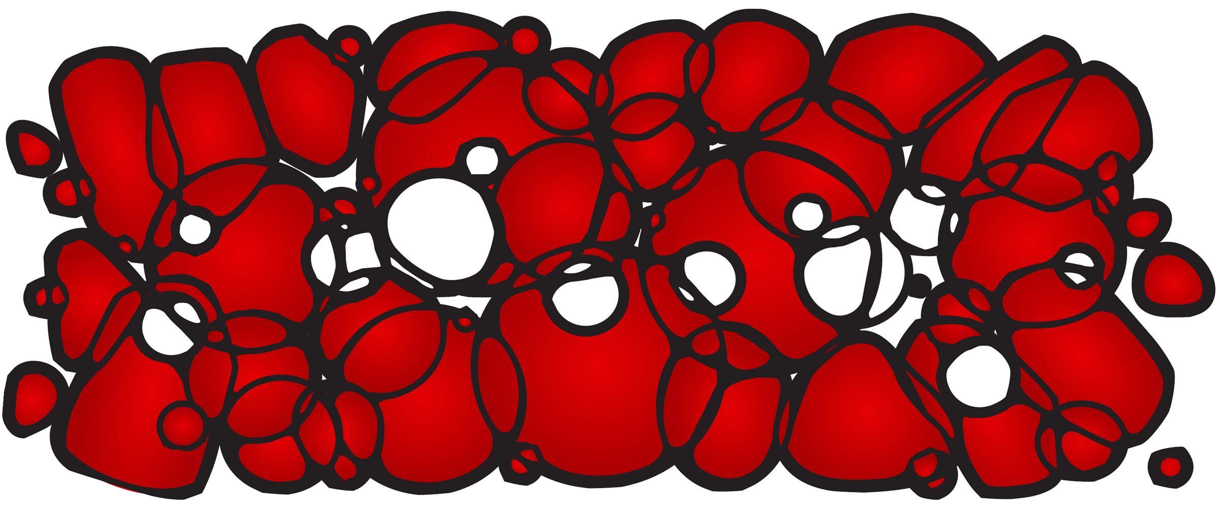
Don’t stop there with the creativity, try additional filters and other effects.
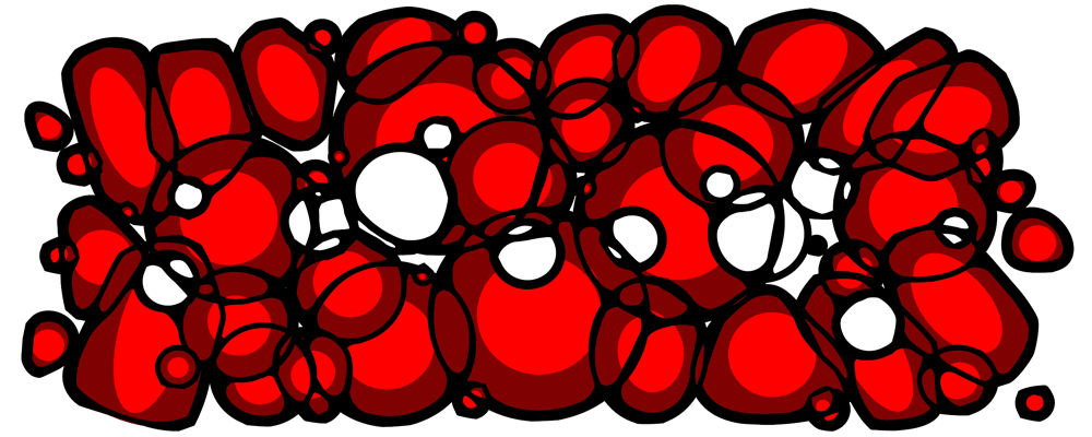
Posterize effect
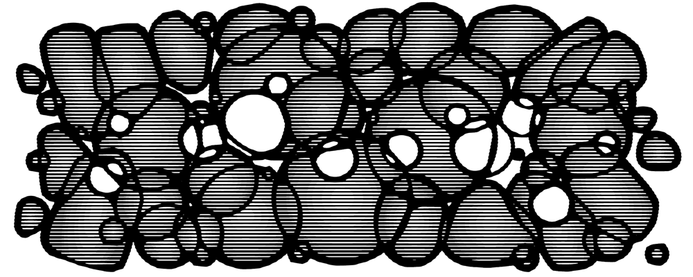
Halftone effect
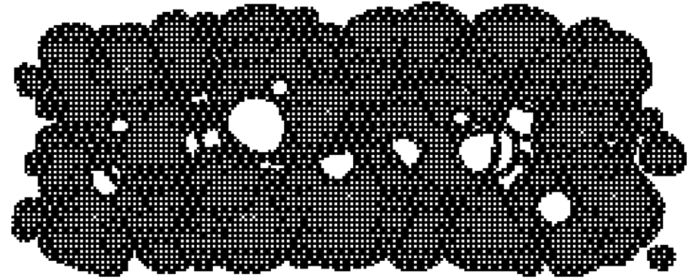
Rasterize bitmap effect
Wrapping up
Whatever we’re calling this thing: Voronoi blobs, cellular shapes, Turing patterns, ink bridges, reaction diffusion… with just a few effects stacked in the right order, it’s easy to make your troubles turn into bubbles!