
Easy Swatch Creation from an Image
Overview
When color swatches are pulled from a specific image such as a product photo, graphic, or other visual, they can help carry the tone and personality of a brand to other campaigns and applications. This focuses on my favorite way to extract colors in Illustrator using the Mosaic command, offers some tips on color management, and how to generate swatch information.
Before jumping in, there are plenty of ways to strip colors from an image with free tools like Adobe Color and hundreds of other palette tools that are sadly/quickly forgotten… like Chromagnon or HueKiddingMe or Tintelligence and so on. Actually, I made those up, but yeah, it seems a new color harmony, color theory, or color picker tool is born every week (listed 100+ real ones at the end).
Getting started
Start off with an image that has the color mood you’re after. Let’s use our friend the opossum here. Drag and drop the image into your Illustrator document, and from the Object menu select Rasterize... The default settings are fine.

Reduce the image to a mosaic of colors
After rasterizing your image, select Object > Create Object Mosaic…

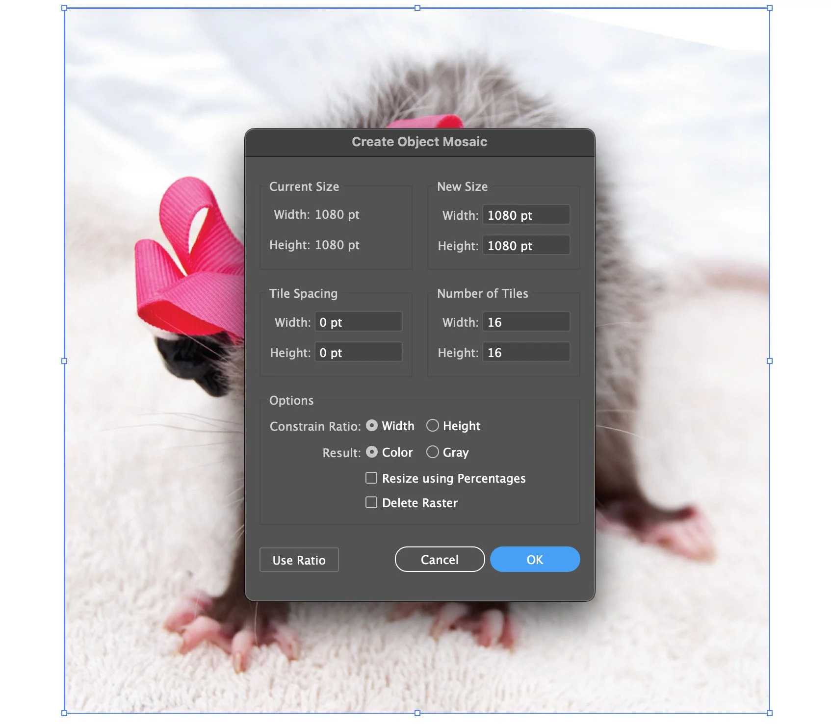
I tend to use more than the default 10×10 tile grid for a wider array of color choices, but really anything will work. Just don’t go overboard because you’ll definitely be waiting a while, or maybe even crash Illustrator altogether if you try to mosaic an image into say, a 100,000+ tile piece.
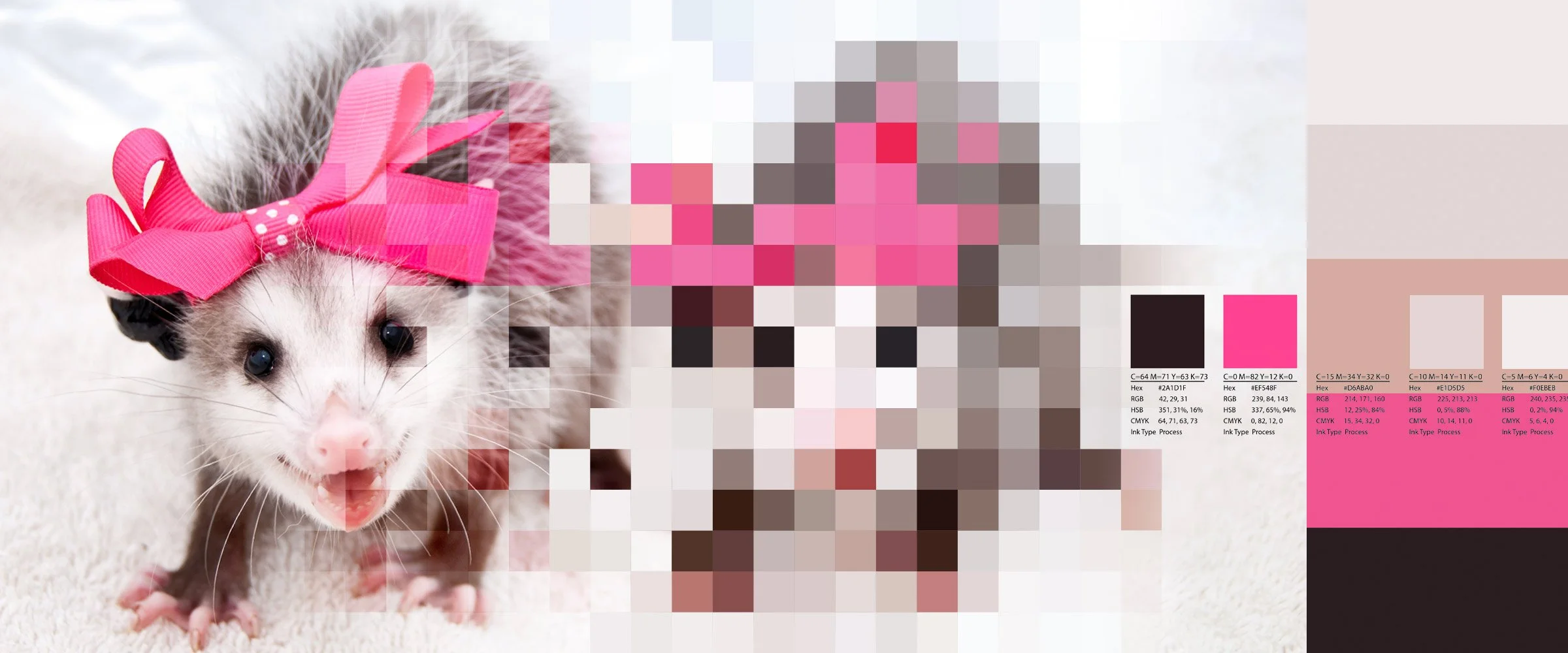
Look at all those color choices. This would make a fantastic quilt or pixel art piece, just saying.
Sample colors from the mosaic with the eyedropper
Make 5 empty shapes (square/circle/whatever) and use the Eyedropper (keyboard shortcut: i) to fill each with a color sampled from the image mosaic. I tend to build the palette by hand from dark to light and usually pick:
One dark color
One light color
One bright accent
Two general purpose tones
Here’s where I landed with the opossum.

Five colors is handy, but don't limit yourself
Illustrator’s color libraries group colors into themes of five swatches, so that’s typically my starting point. If you are using the online Adobe Color tool (which is fantastic and free BTW) you can manage as many as 20 swatches to build huge color libraries and slick harmonies without bothering to use Illustrator at all.
Adding the swatches to your library
Now that we have our five color palette, let’s get everything added to the Swatches panel and Library so we can use these colors everywhere.
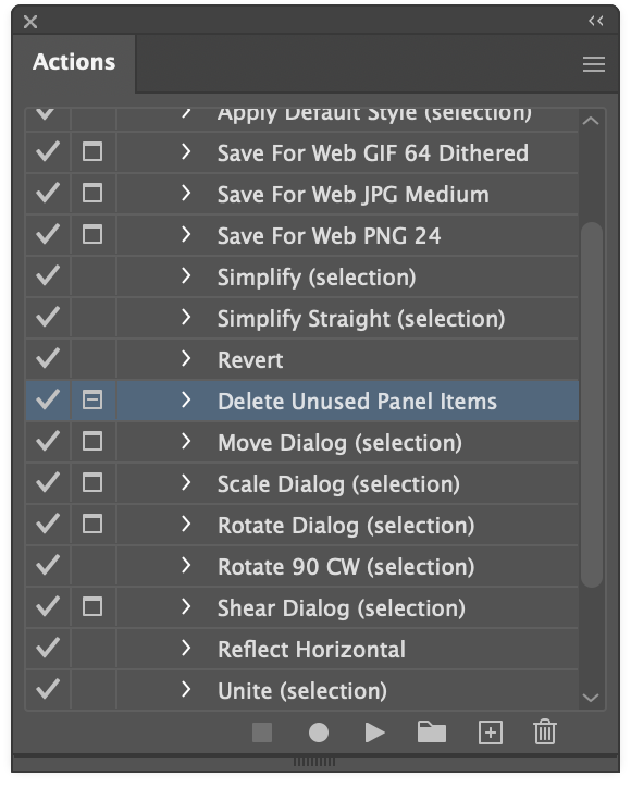
Remove unused swatch and panel items (optional)
First though, as an optional step before we add our colors, it’s worth a moment to clean out Illustrator’s defaults and tidy up the place. Open the Actions panel and find the default action called Delete Unused Panel Items. This will hunt down every swatch, brush, and pattern and delete them from the current document. The main benefit being should you want to save your swatches as an .ase or .ai file, it won’t contain all this garbage. These defaults are just noise anyway.
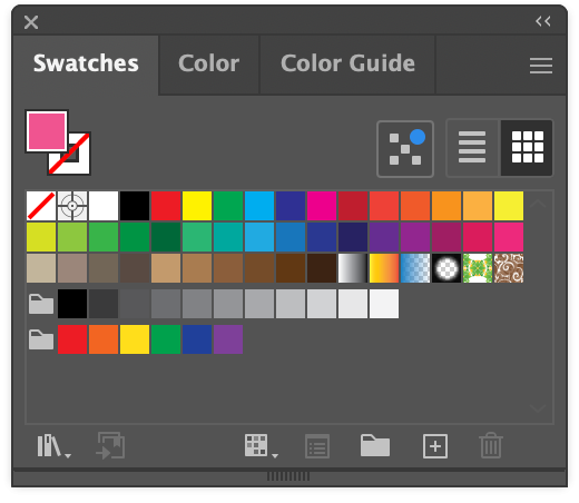
Default swatches and patterns.

After removing all the unused, default swatches.
Create a new swatch group
What a tidy Swatches panel! With your five colors selected, head to the Swatch panel and press the New Swatch Group folder icon.


Name your group and choose the option for Selected Artwork (because our colors aren’t swatches yet), and choose the Convert Process to Global. The global checkbox is especially important as it will allow you to change the swatch color from the swatch panel directly to mass-edit everywhere it’s being used. It’s a good practice to always use globals, and is a really great quality of life option to tweak colors more easily later (especially with CMYK values and precision).

The final swatch panel will look like this. The small white dog-eared corner on each swatch indicates a global color.
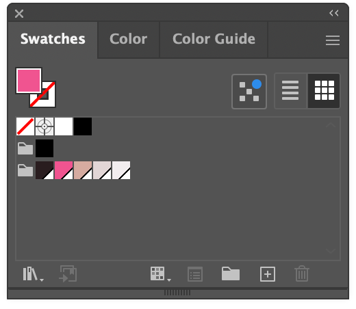
Our swatches are now custom global colors.
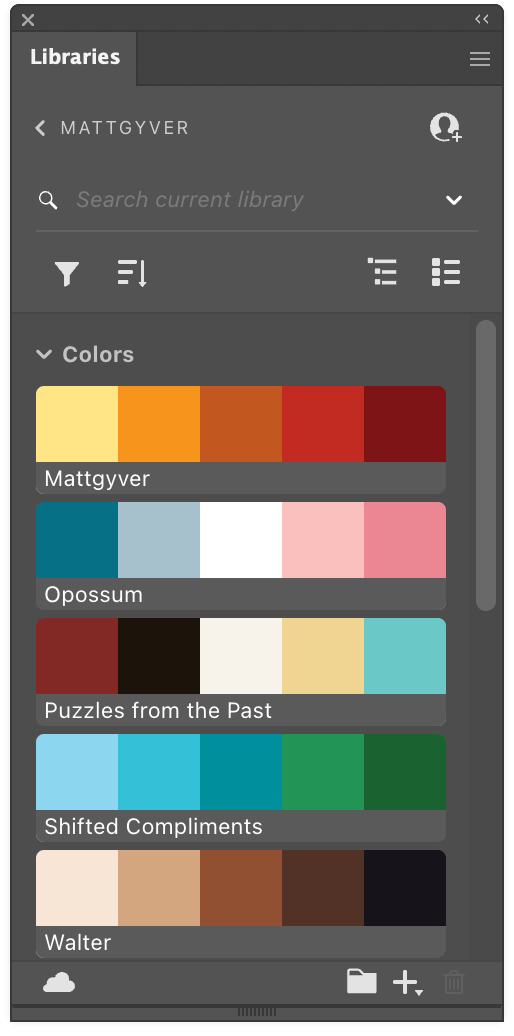
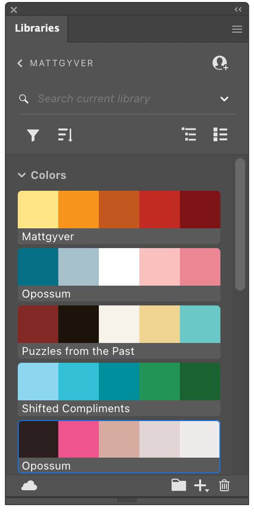
Add the swatches to your main library
The Adobe Library gives you access to your swatches, brushes, patterns, and pretty much everything across all your documents, anywhere. To add your swatches, select the newly created swatch folder and hit the Add selected Swatches … to my current Library. Your palette of five colors will appear in a nice compact grouping. Drag to rearrange or rename if needed.
I prefer Library entries most of the time, because keeping track of physical files like .ai and .ase gets tedious unless they are truly special or need to be shared/emailed/etc.
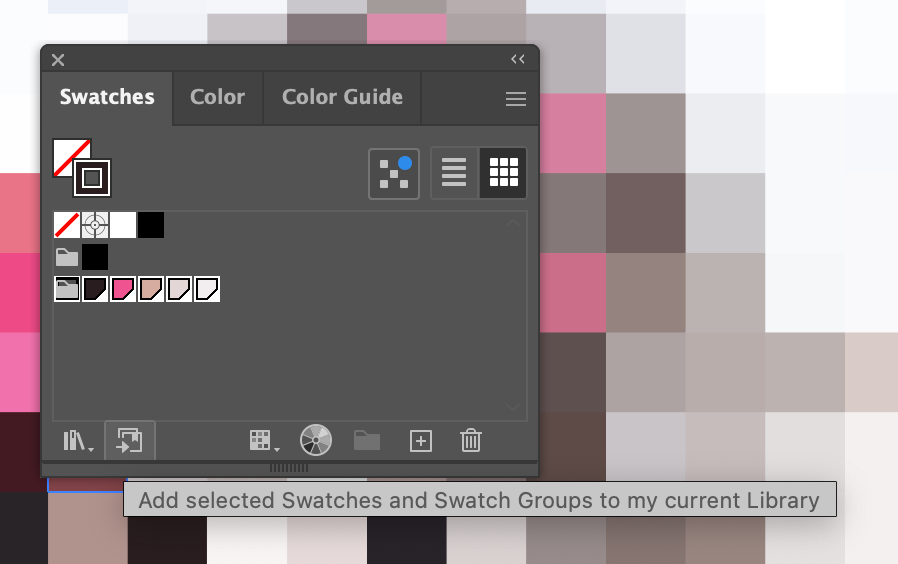
Add the selected swatches to the library.
Documenting swatch info
Sharing your colors for print or with another team is super duper easy in Illustrator. The Create Swatch Info command added to the Swatches panel (early 2025) had all the design “influencers” bugging out like this is the best thing since sliced bread for the likes and follows and “thx bro!” “sick!” and “dope!” and whatever else kids say these days.
Think creating swatch info is nice? Wait until you influencers learn about the OG Package command; the one true GOAT 😎 Maybe I’ll make a quick write up for that. OK, here goes: File > Package. There, done. Enjoy! Colors, fonts, art, all of it, nicely wrapped, all defined within the included .txt doc, and ready to ZIP and deliver. Remember to like, follow, and subscribe.
The old way
Remember the days of screencapturing swatch panels or having to actually write stuff down? No longer!

Creating swatch information the new way
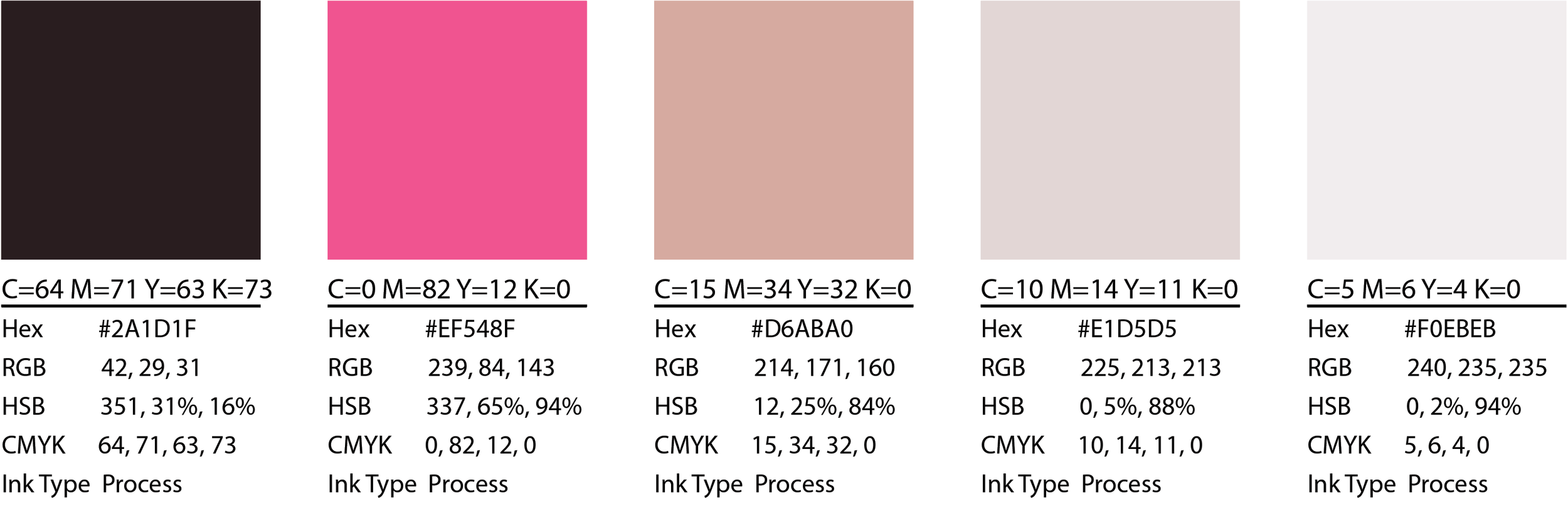
The Create Swatch Info command will generate the color data for any selected swatches for you. To list all the colors and their values, select your swatches, open the Swatches panel hamburger menu, and select Create Swatch Info… Choose whatever info you need, and that’s it. You get a nicely formatted layout of the chosen color’s info.

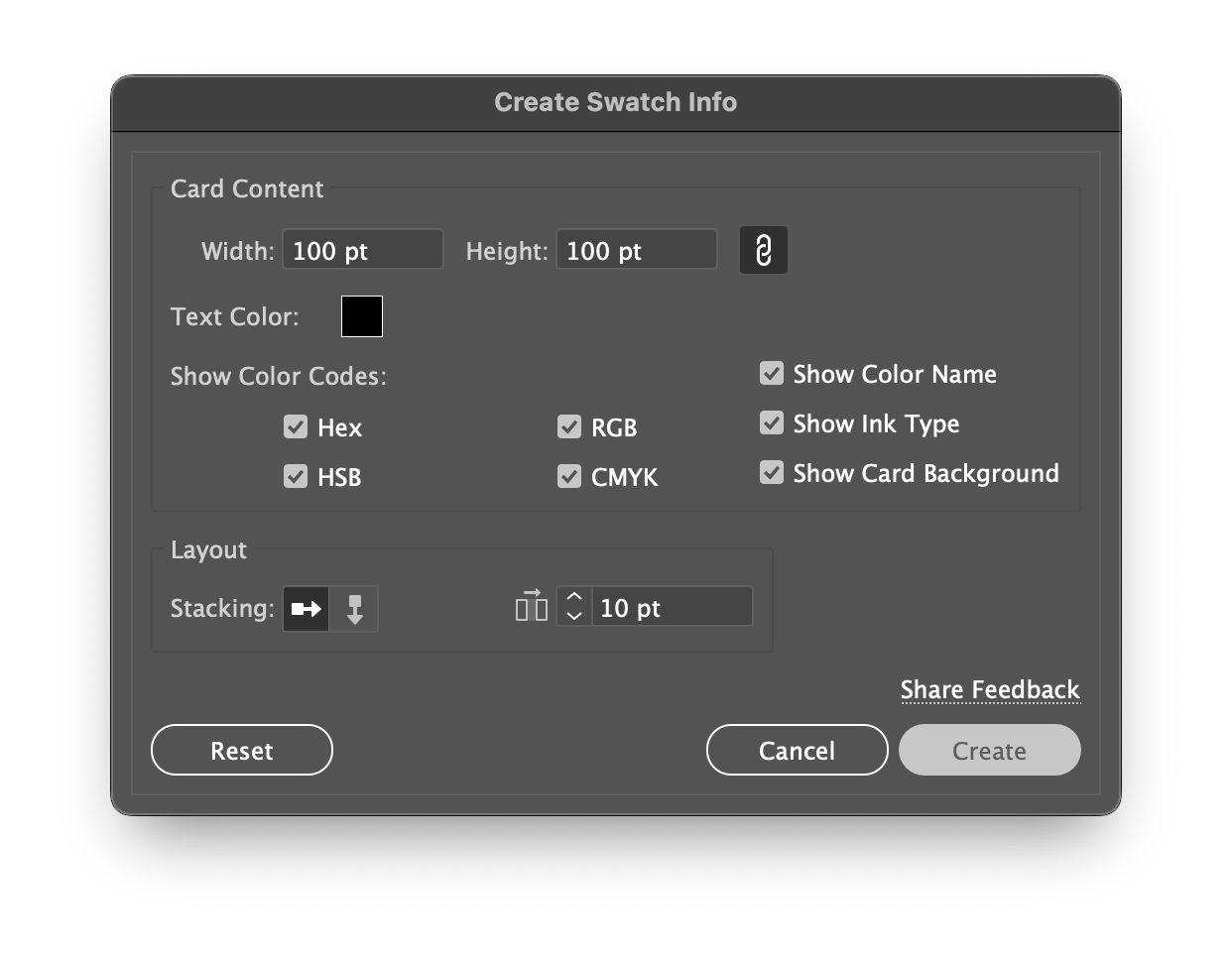
Very minor limitations, but worth mentioning
There are some really minor limitations with this, mainly in print applications. Any spot colors (not process like shown above) are converted to their CMYK equivalents which makes eyedropping inaccurate, though each color name will still show the swatch name like Pantone 123 instead of C= M= Y= K=… and show the Ink Type as Spot. This is all really pedantic though; a printer will still source the Pantone ink by name if they aren’t printing CMYK or Lab or one of those other methods. At that point it’s clear you know what you’re doing in the handoff and will be doing press checks and whatnot anyway.
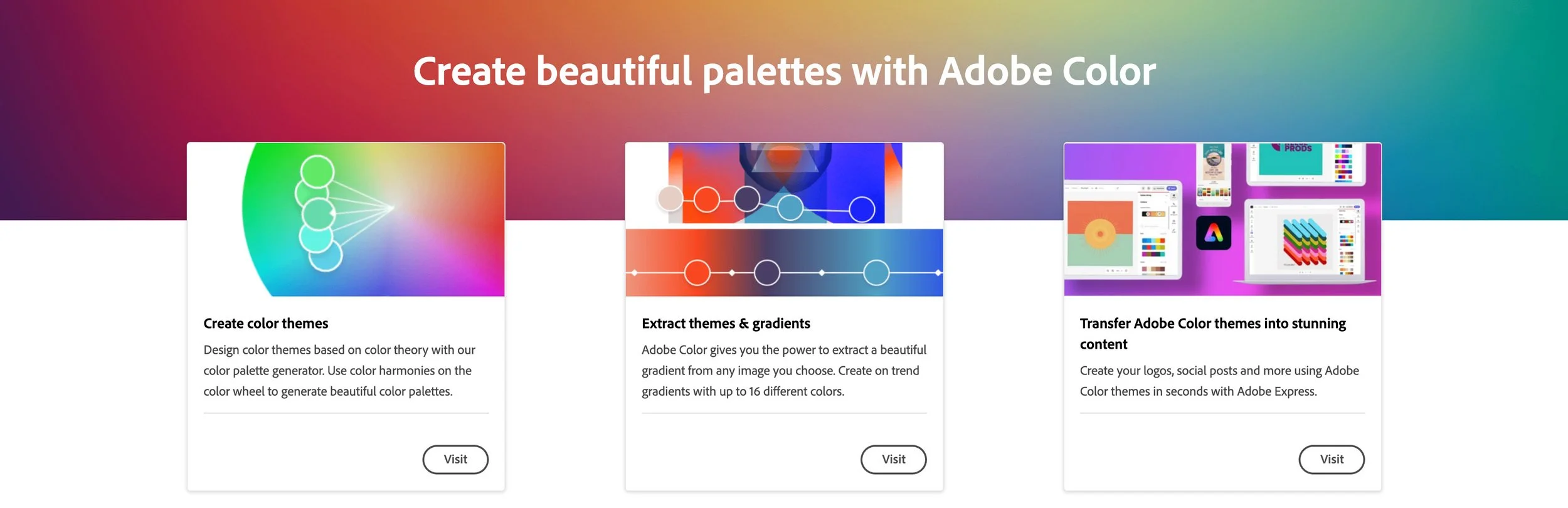
Adobe Color, A free alternative
I won’t go into things too much here, but explore the Adobe Color website to build palettes and harmonies, extract colors from images, and recolor artwork easily. There’s a lot on offer, and if Illustrator isn’t your thing, this is more than capable.
Really though, this is what I would probably use if I bothered to do more serious color work. Part of the journey is all about finding a workflow that works best for you.
Adobe Color website.
Alternative color tools
Every time a color tool is invented, an angel gets its’ wings. You could try any one of these other color tools. Apologies that I didn’t include any links, but everyone knows how to ask Copilot or Google anyway:
HueSnap, Khroma, Coolors.co, Gradients.io, Colormind, Eggradients, ColorSpark, Colordot, Color Hunt, Colorable, LOLColors, Site Palette, Material Design Palette, 147 Colors, Culrs, Color Leap, Colormatcher AI, Canva’s Color Palette Generator, Art Palette by Google, Eva Design System, Muzli Colors, Picular, Color Space, ColourCode, Color Calculator by Sessions College, HTML Color Codes, W3Schools’ Colors Tutorial, Digital Color Meter, Happy Hues, Paletton, Color Designer, Color Inspire, Pigment, Blend, ColorZilla, Palette Creator, Color Buddy, Designspiration, Material Design’s Color Tool, Palette List, Huemint, Pppalette, Color Scale Generator, CopyPalette, LCH and LAB Color Gradient Picker, Accessible Palette, Data Viz Color Palette Generator, Leonardo Color Scales, ColorBox, Subcolor, ColorKit, Paletter, Open Color, Tinter, Gradient Art, Palitra, Spectrum, Atmos, Hue.tools, Palettemaker, Alphredo, Colorca, ColorMagic, Poline, ColPat, Palette Hunt, OddContrast, Colorinspo, Duo, Colors.lol, Color Controversy, Color Selector, Huey, Cheeky Palettes, Color Huddle, Goodpalette, Supa Palette, Randoma11y, Tone, Realtime Colors, Spectrum Art, Grabient, CoolHue 2.0, Gradient Hunt, WebGradients, Gradihunt, CSS Gradient, Mesh Gradients, Design Gradients, Chroma, Ingradients, Gradientos, Color On The Web, TinEye MulticolorEngine, Colorschemer, Colllor, Color Blender, Degraeve’s Color Palette Generator, Mudcube, PaletteGenerator, ColorExplorer, ShaderGradient, OKLCH Color Picker, Color Fuse AI, and Color Pal.
Enjoy! There’s no shortage of color tools out there.
Wrapping up
By crafting color libraries and documenting swatches for consistency across branding and illustration projects, designers can ensure that every visual reflects a unified aesthetic; from packaging to digital.
There is a mountain of material available for building swatches and working with color, so I hope this primer on how to break an image into a mosaic, grab a few colors, and form an actual library palette was a refreshing and digestible tutorial. Thanks for reading!